Strategy | Creative | Digital | Interior
Pivotal Housing Association
The strategic challenge
When stability is everything, the identity must mean it
What we did: Naming · Brand strategy · Visual identity · Writing · Print ·
Digital design · Photography · Film · Signage · Interior design
The design challenge
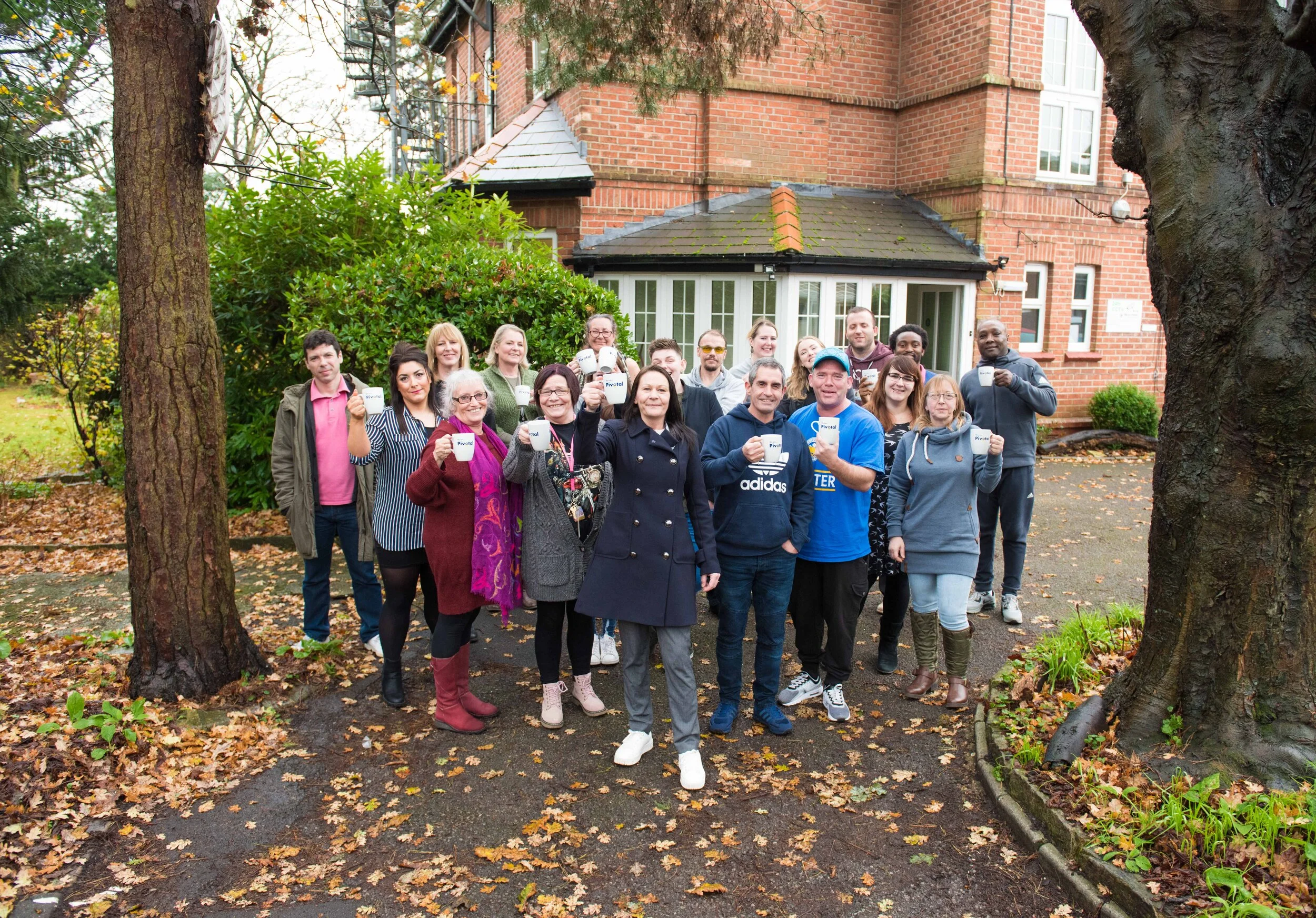
PAS Housing did extraordinary work, supporting almost 400 vulnerable people with housing, care and the kind of patient, sustained help that changes lives. But the name said none of that. An acronym that few could decode, it communicated nothing about the human reality of the organisation or the ambition of its vision.
The brand needed to do what the people inside it did every day: offer something to hold onto.
What we solved
Working with creative writers A Thousand Monkeys, we began with naming. The word Pivotal emerged as the answer, and it earned its place immediately. A pivot is a point of balance, a moment of change, a choice that determines future direction. For an organisation whose entire purpose is to help people find stability and move forward, it was precise without being literal.
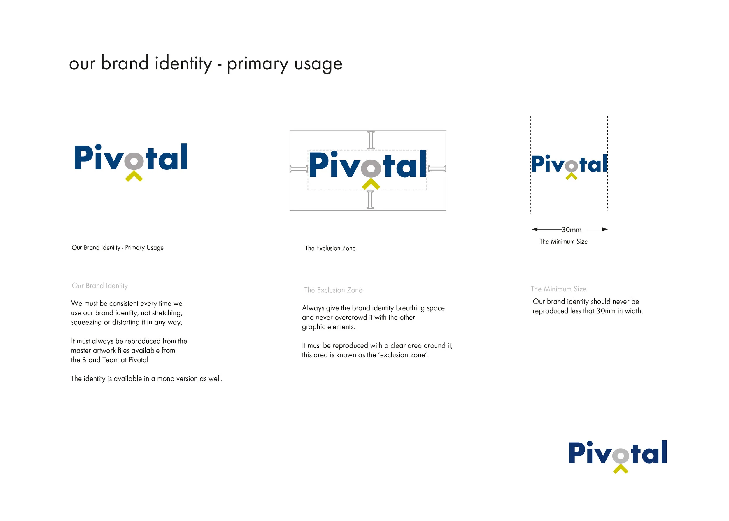
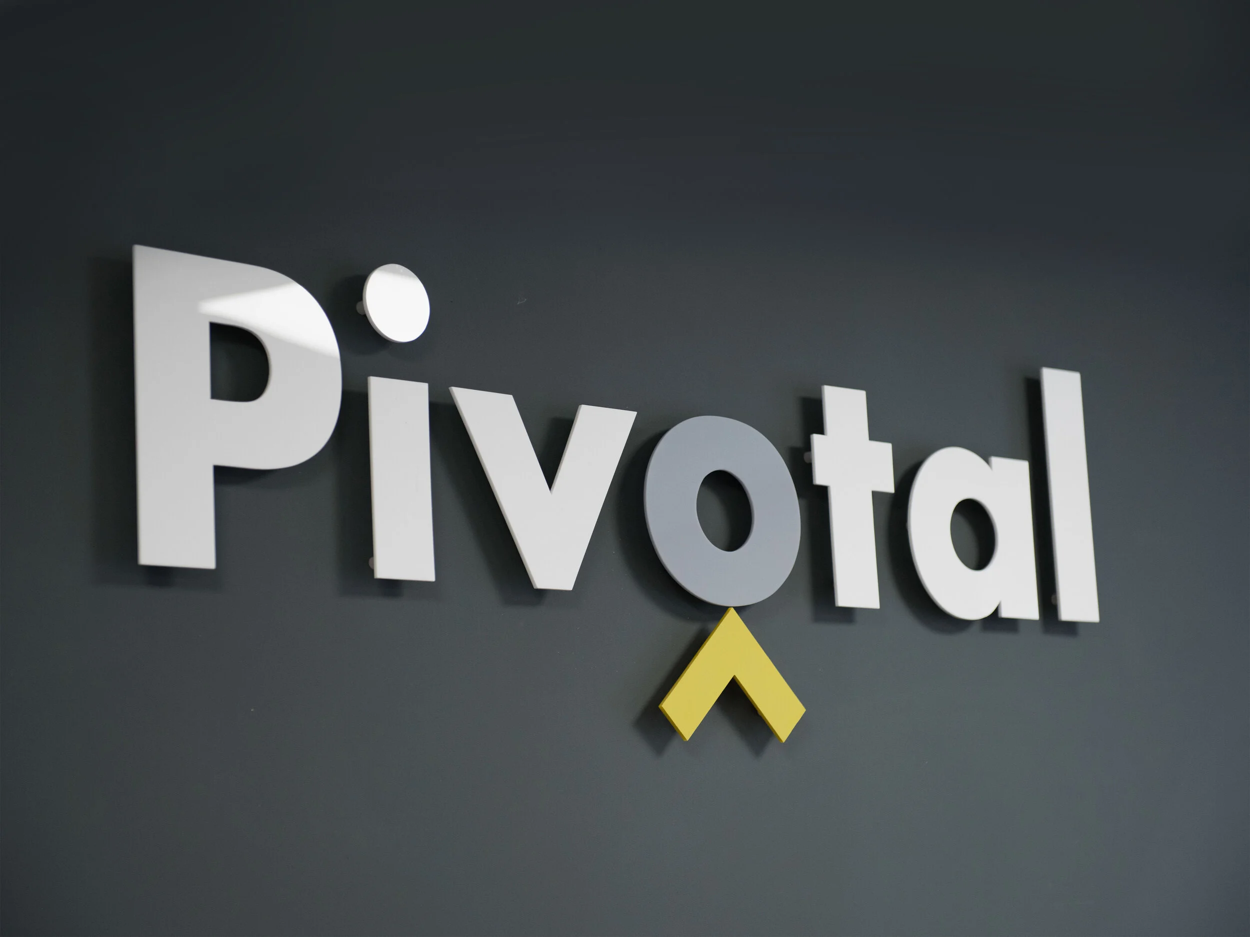
The word itself became the design. Futura, geometric, balanced, humanist - gave the identity its typographic foundation. The letter O, the most circular form in the alphabet, became the centrepiece: a pivot point, a window, and with a small roof device anchored beneath it, a subtle symbol of shelter, stability and the possibility of home. The natural symmetry of the word Pivotal meant the logo had an inherent balance that needed no decoration.
The human story
The identity had to speak to commissioners, investors, the NHS and local authorities, and simultaneously to the people being referred into the service and the dedicated staff who support them. That is a genuinely difficult design problem, and the answer was found in film.
Two documentary films were commissioned, sound recordings layered with photography, no faces shown, no properties identifiable, told the story from the inside. The first, A Place to Call Home, followed three clients whose lives had been transformed by Pivotal's support. The second gave voice to the staff. Together they communicated what no logo or colour palette could: that this organisation changes lives, one careful step at a time.
The full application
The identity extended across print, digital design, signage and internal graphic communications, as well as the interior design of the head office, a space that needed to feel as considered and human as the brand itself. The work was subsequently carried forward by Pivotal's in-house team under the brand guidelines we established.