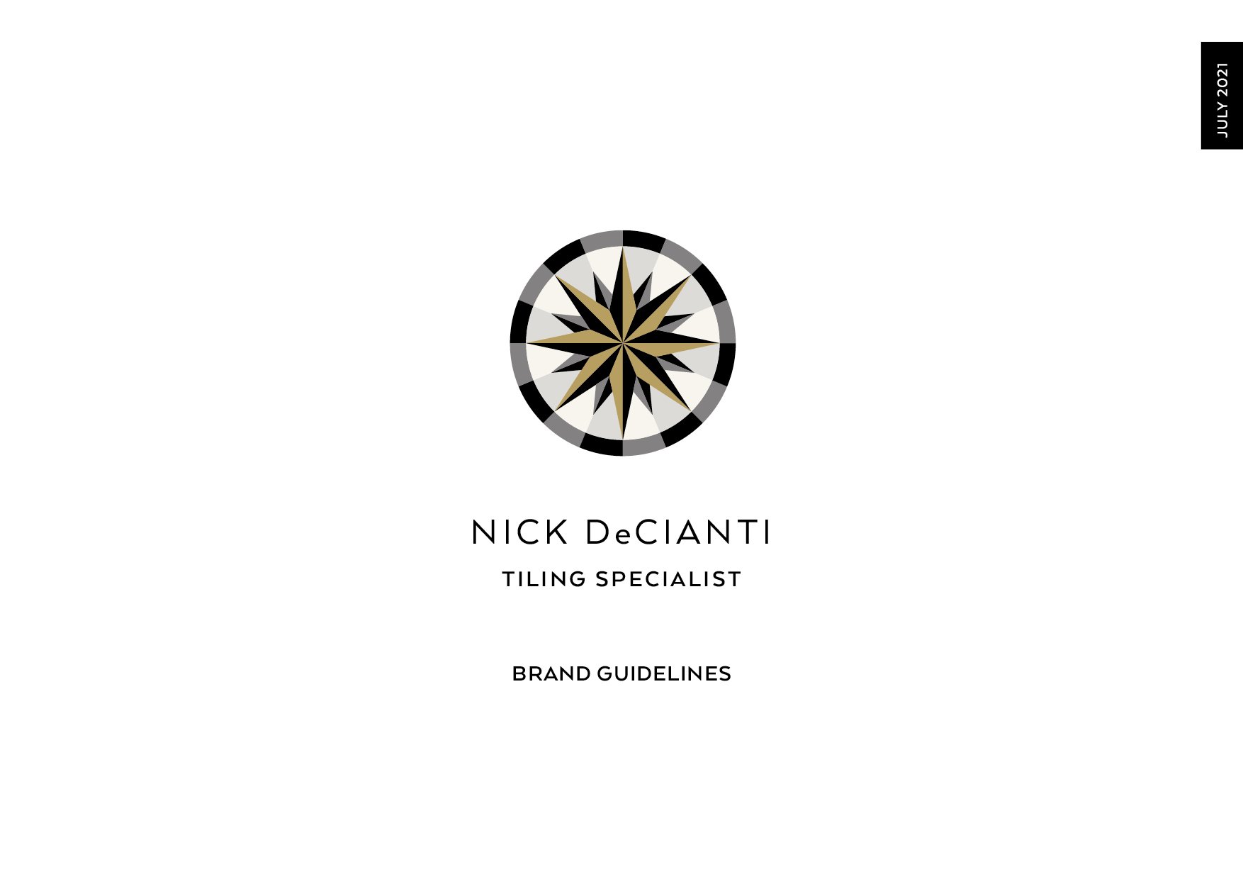
Branding | Website | Print | Uniform
Nick de Cianti
The strategic challenge
Craftsmanship deserves a brand to match
What we did: Brand identity · Tone of voice · Website design · Print · Stationery · Uniforms · Vehicle livery
The design challenge
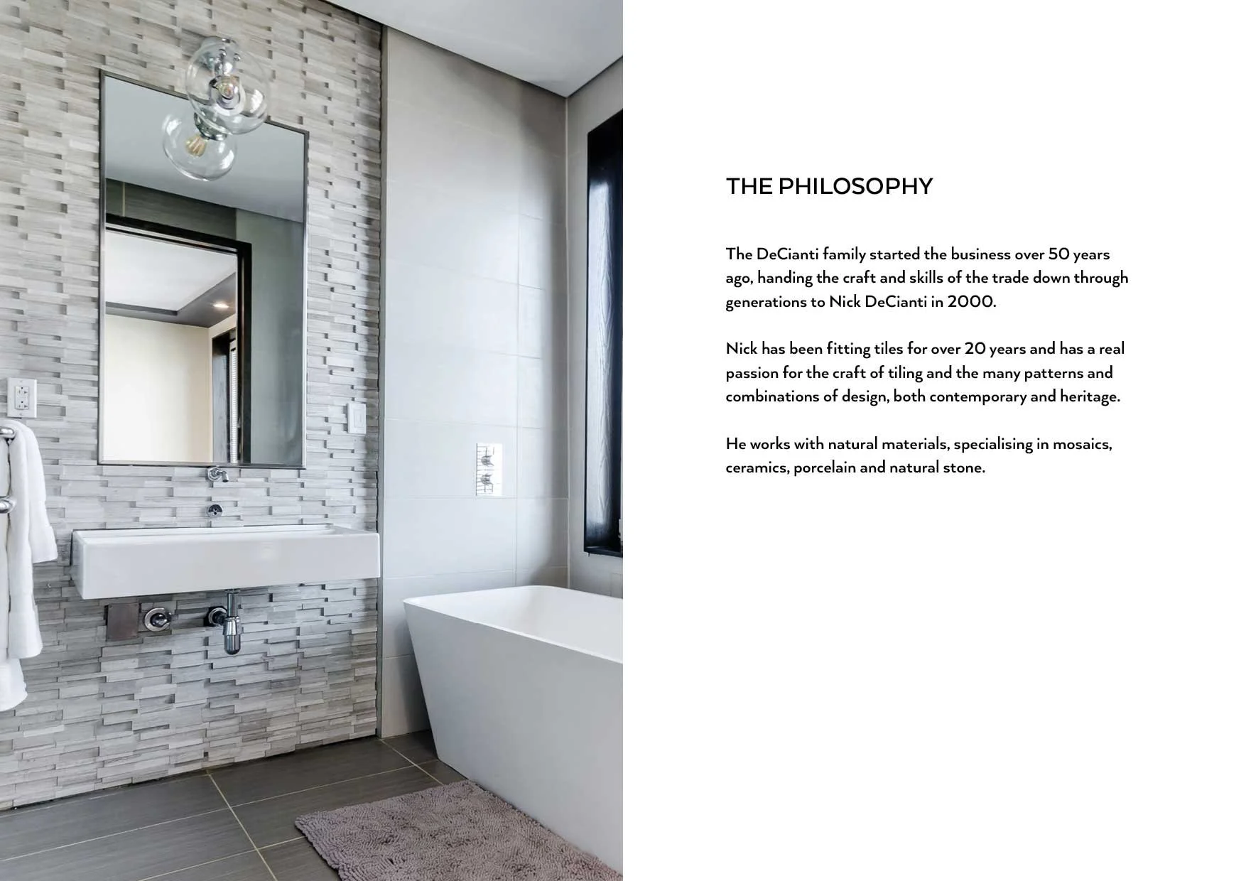
Nick De Cianti is exceptional at what he does, designing and restoring stone and tile for heritage homes and interiors, working at the highest end of the craft. But his brand wasn't telling that story. For clients commissioning sensitive, skilled work on significant properties, trust and aspiration have to be established before anyone picks up the phone. The identity needed to do that work.
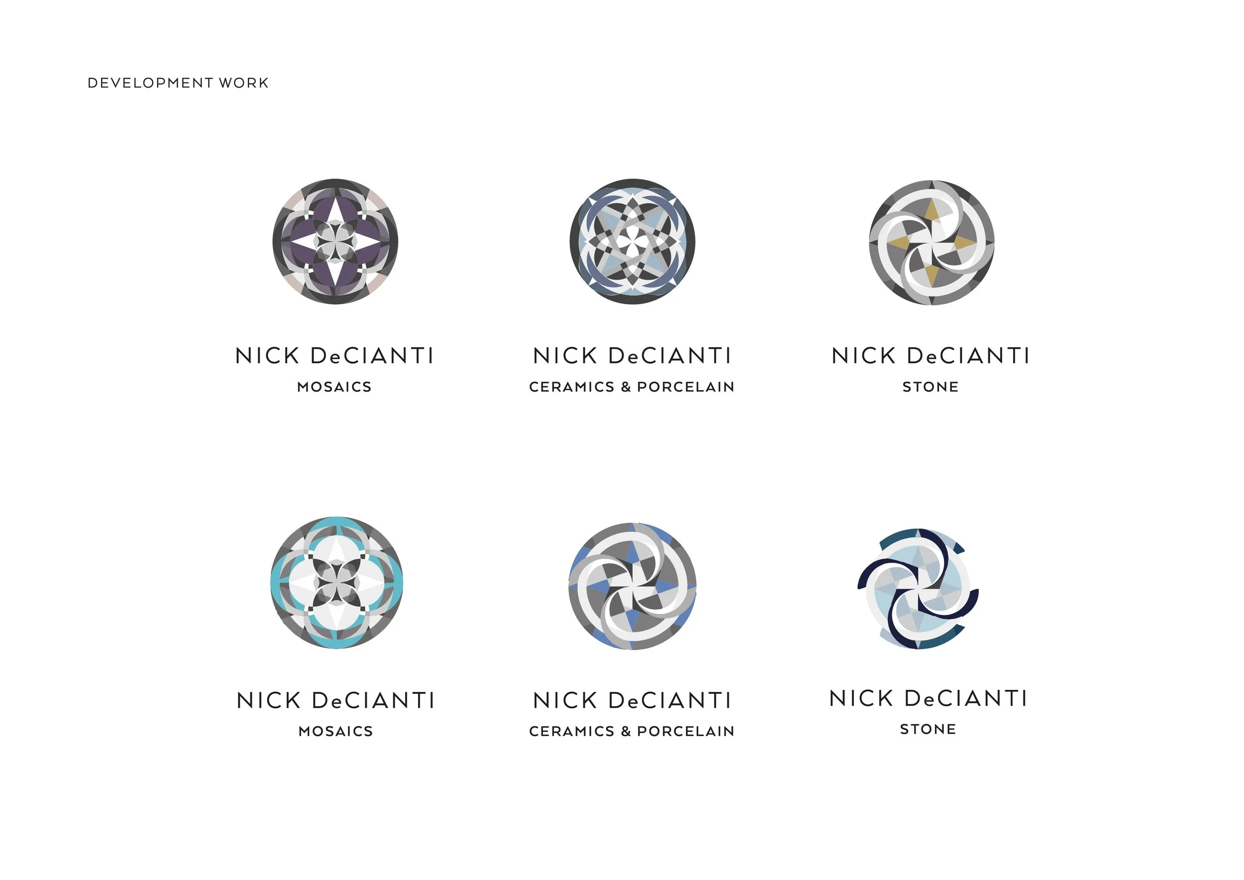
The Solution
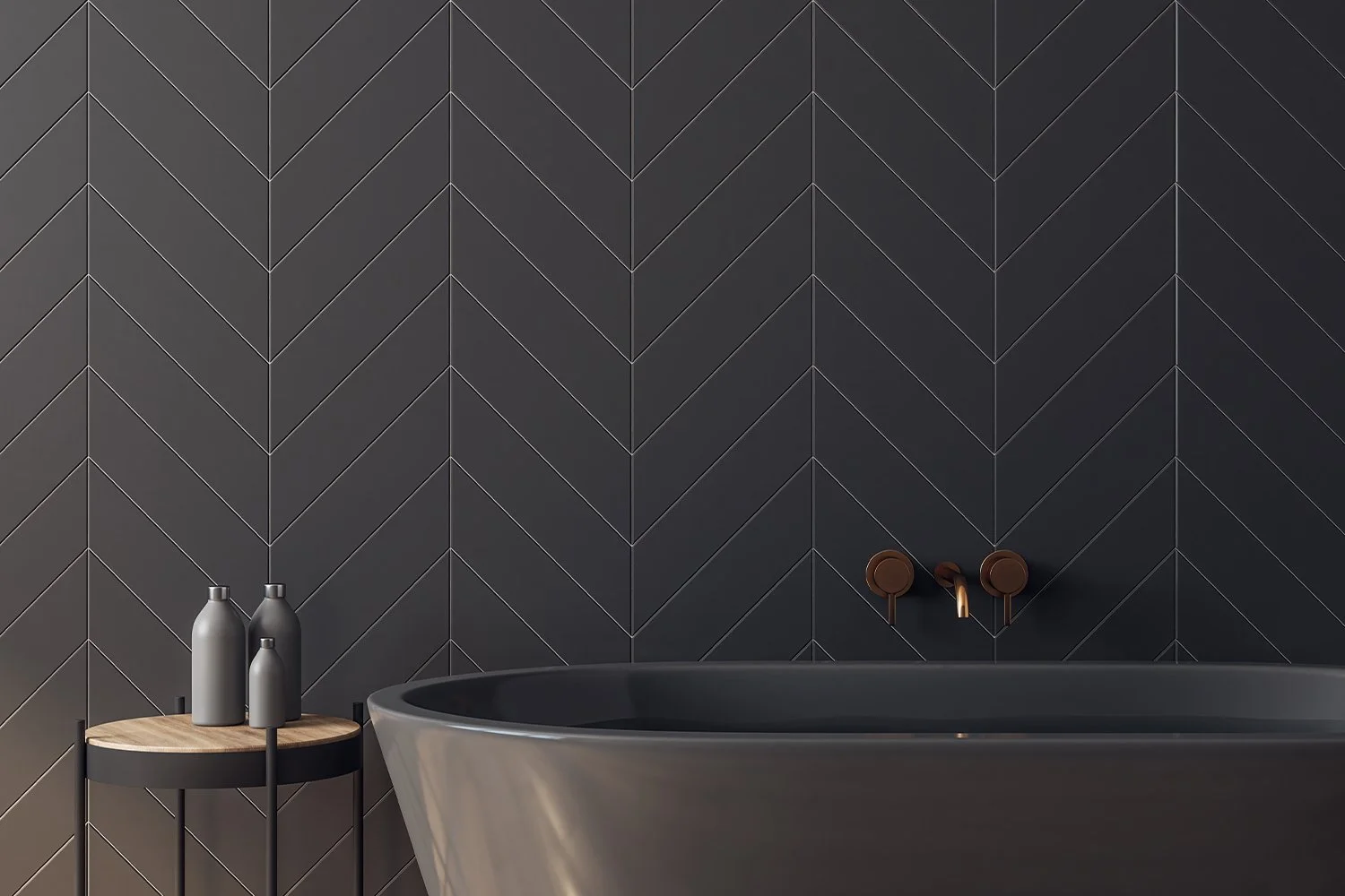
We started where the craft itself begins, with research. We visited the Victoria and Albert Museum, sketching and photographing historic pattern books of porcelain and stone tile. We drew further inspiration from a trip to Lisbon, studying the tiled shopfronts and floors that have defined the city's visual character for centuries, the colours, the geometry, the way pattern and material work together in heritage interiors.
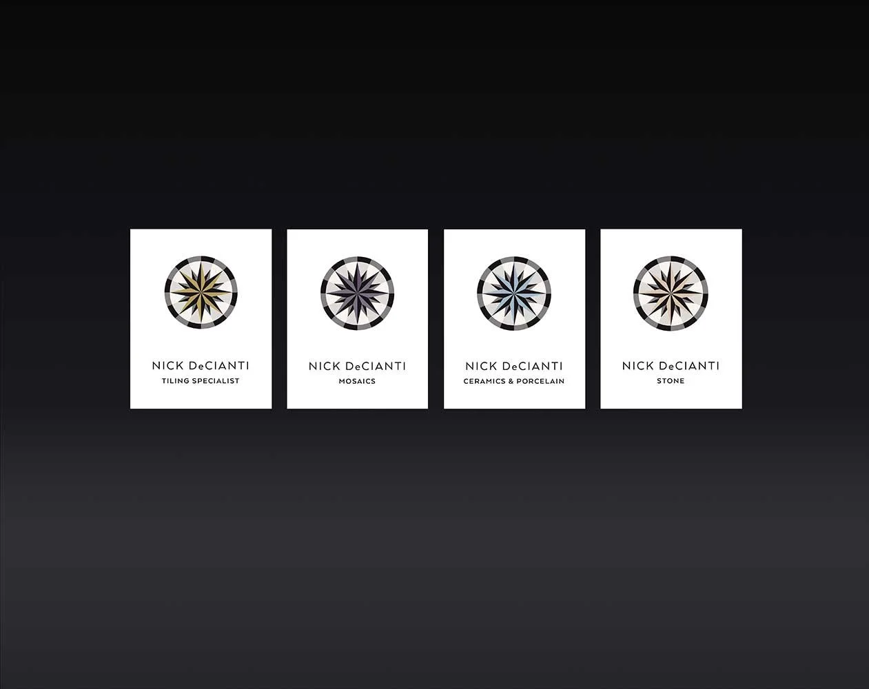
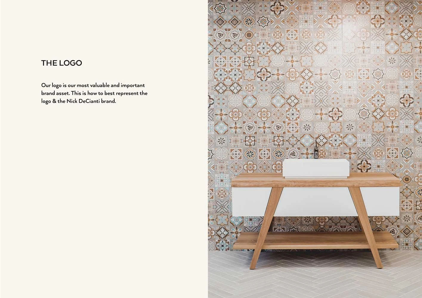
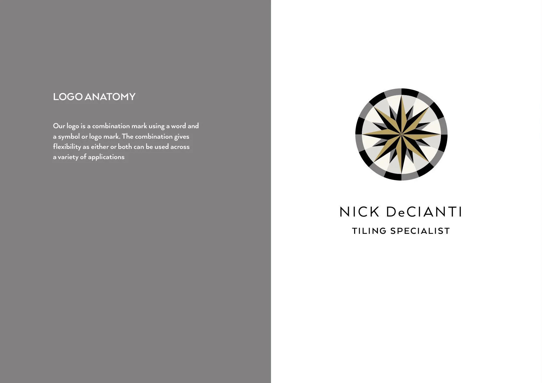
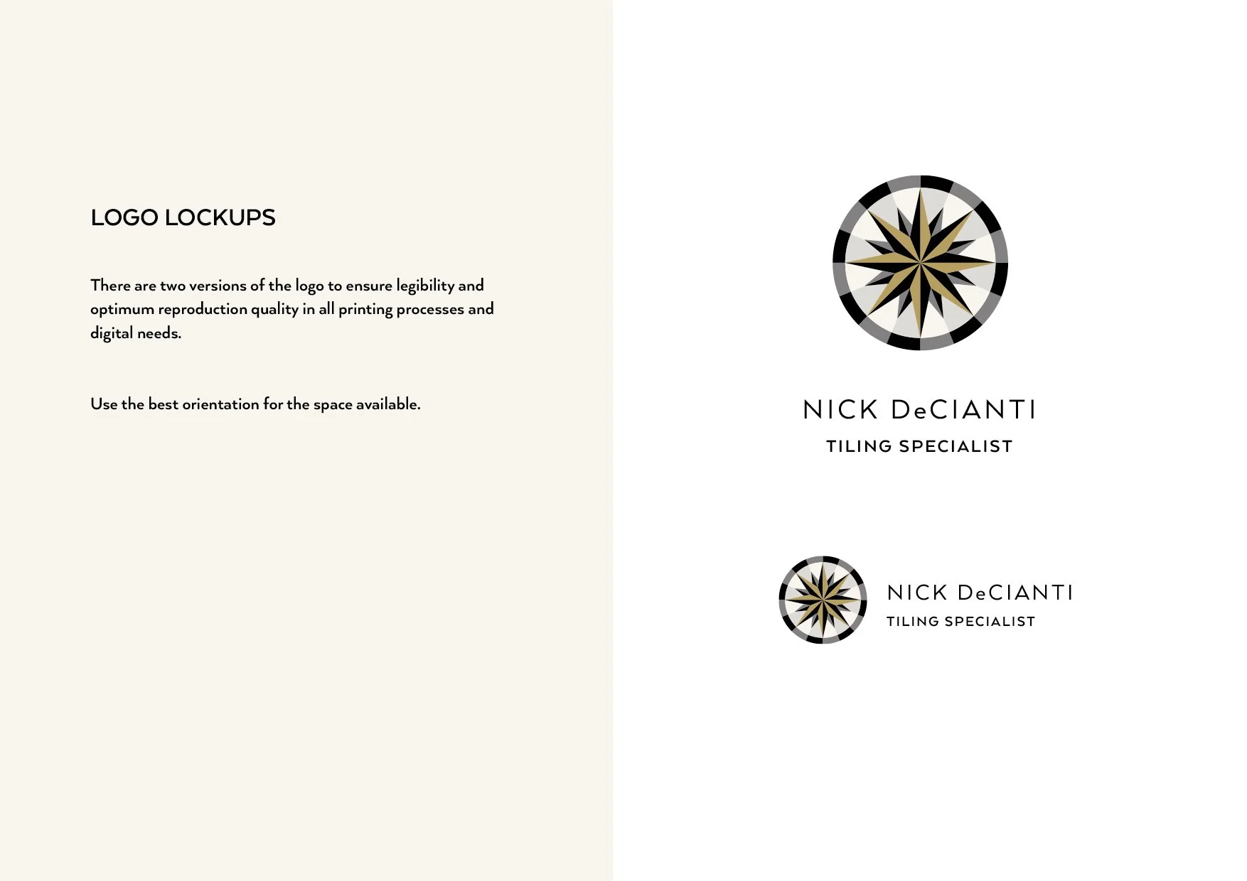
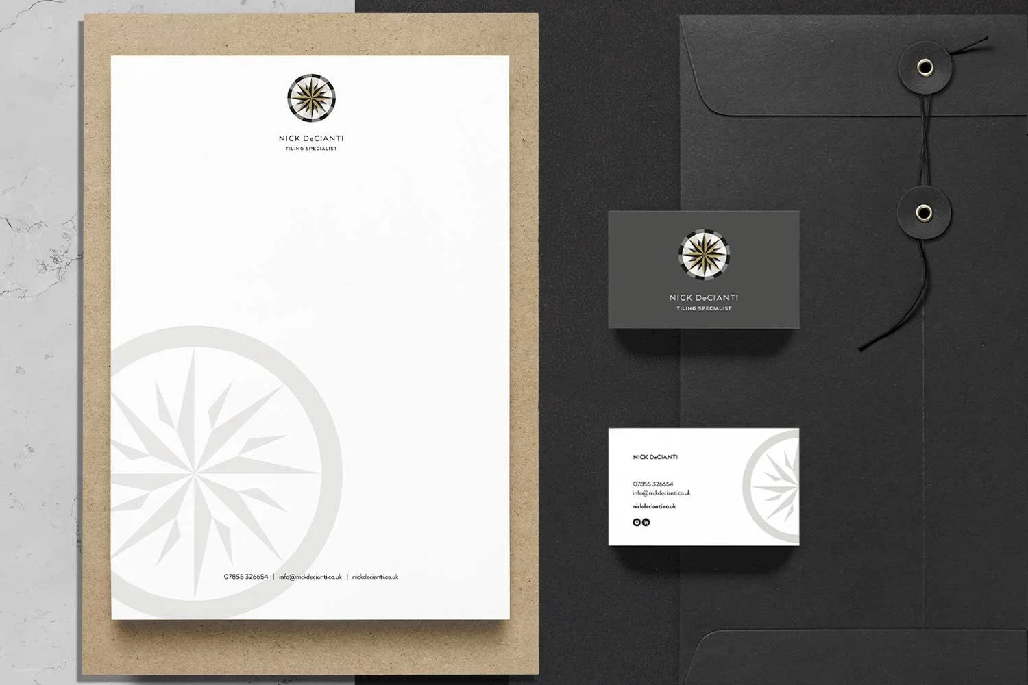
From that research came the compass rose, a repeat tile pattern that became the foundation of the logo. It was the perfect metaphor: navigation and direction, guiding Nick's clients through an extraordinary range of colours, patterns, materials and historical periods. Simplified and paired with a clean, modern sans serif, it sits at the intersection of heritage craft and contemporary elegance.
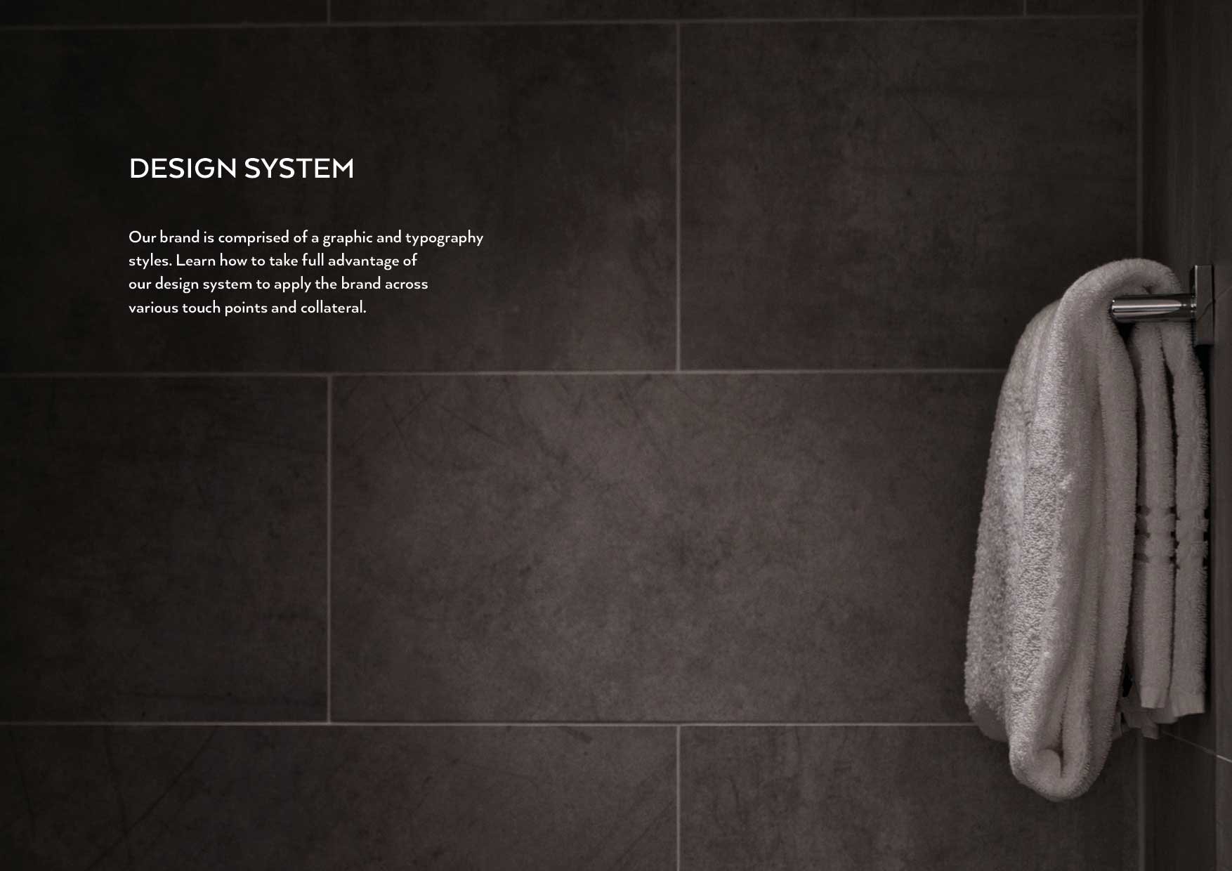
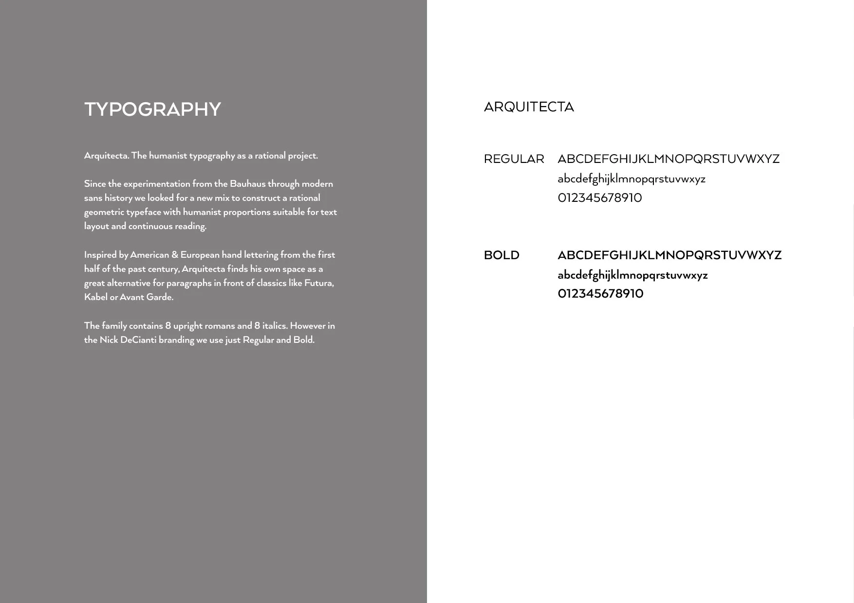
The sensory language of the brand
Tile and stone are intensely sensory materials — the cool weight of marble underfoot, the geometry of a Victorian encaustic floor, the way a glazed surface catches light. The brand had to carry that quality into every touchpoint.
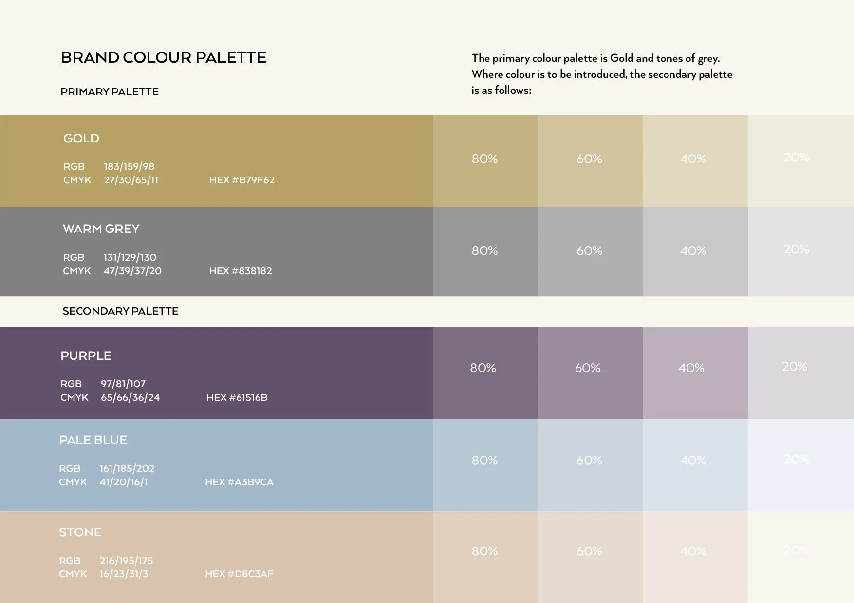
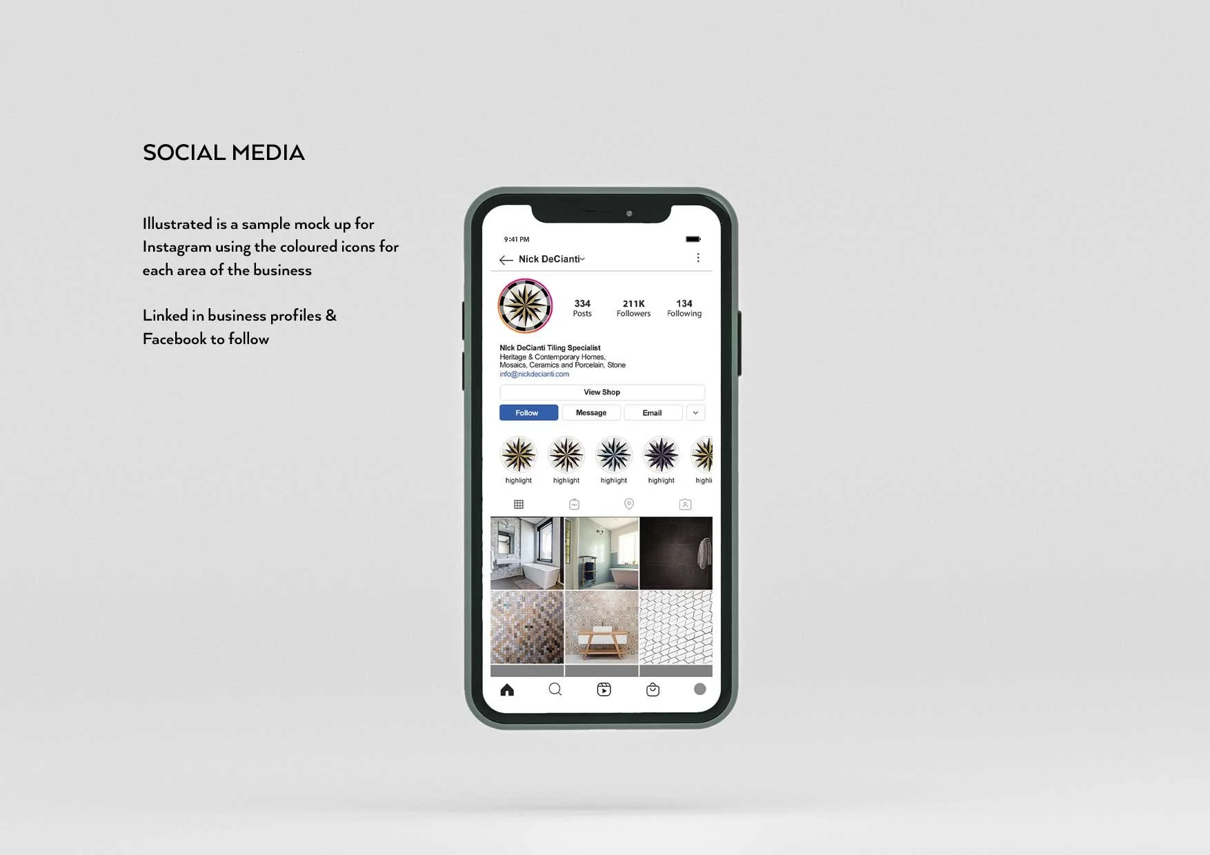
A primary colour palette rooted in heritage tile-making was complemented by a secondary palette translating across Instagram story icons — each representing a different range or material. Testimonials were woven throughout the messaging, because in a trade built on reputation and word of mouth, the voice of a satisfied client is the most powerful brand asset of all.
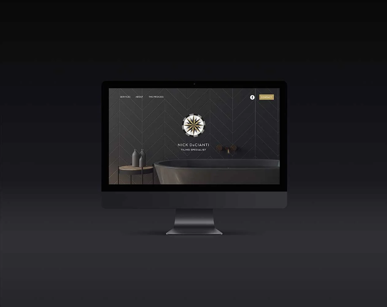
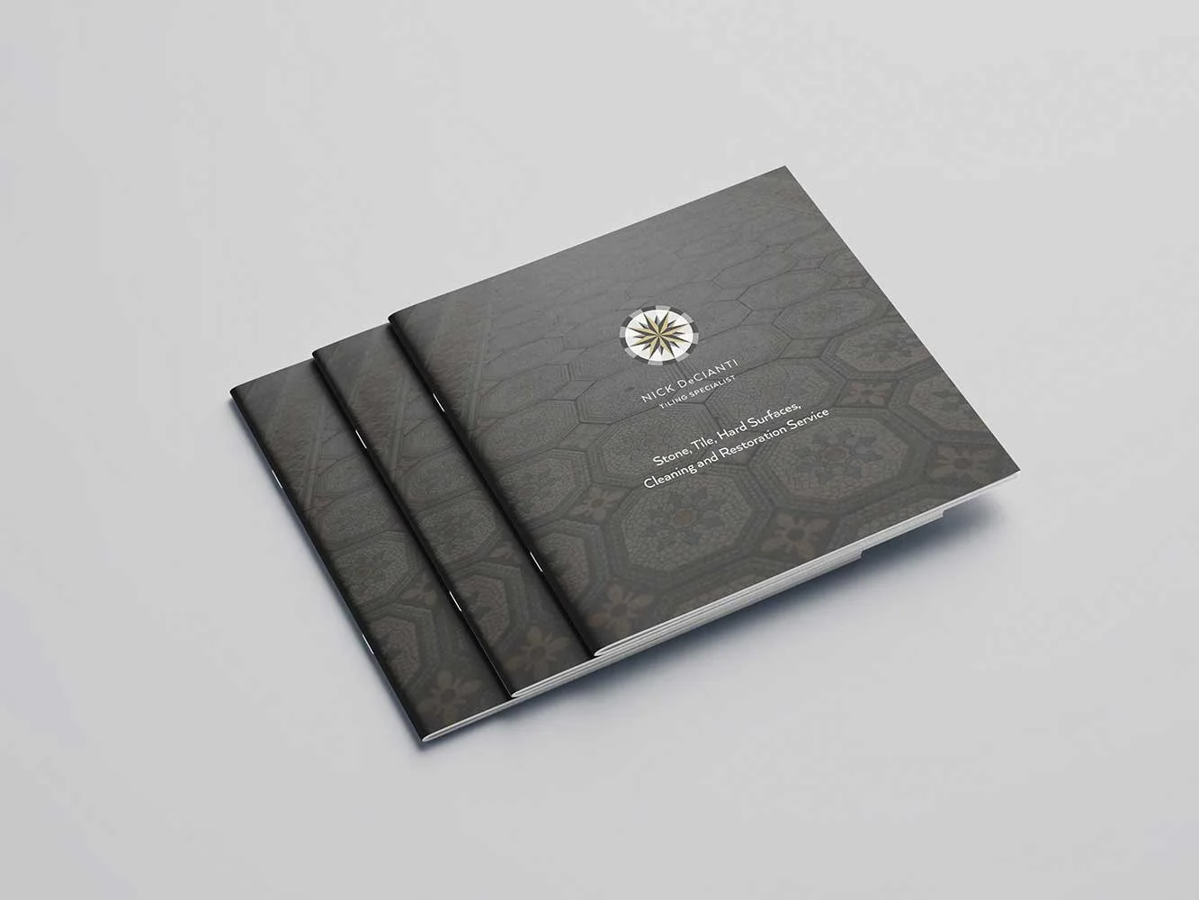
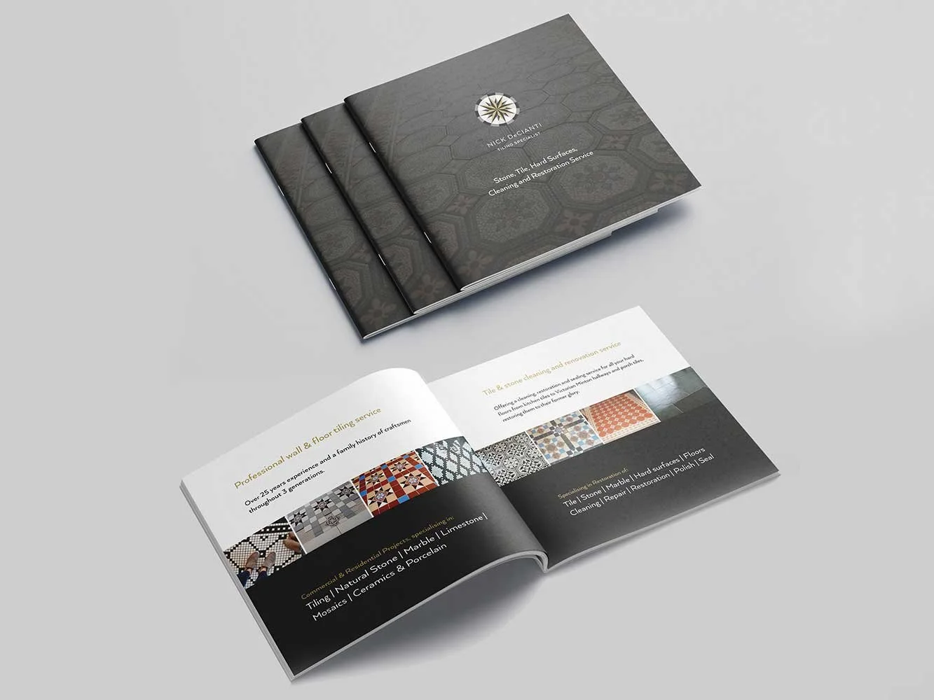
The design application
The identity extended across a full website designed and built with digital partner Tom, stationery, brochures, van livery and uniforms, every surface considered, every detail consistent with the quality of the work it represents.