Creative | Branding
The New Forest Trust
The strategic challenge
Making two identities feel like one family
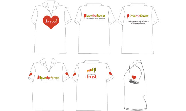
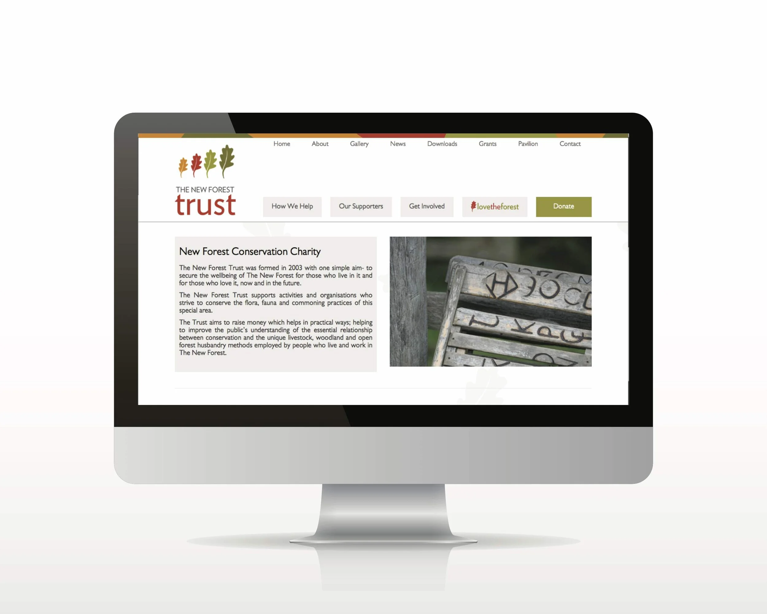
What we did: Corporate identity · Fundraising identity · Print & campaign materials · Exhibition design · Uniforms · Website visuals · Editorial design
The design challenge
The New Forest is one of the oldest managed landscapes in England, ancient woodland, free-roaming ponies, a community of Commoners, Agisters and Verderers whose rights and responsibilities stretch back centuries. Designing for an organisation that exists to protect all of this carries a particular weight.
The brief had an elegant complexity. The New Forest Trust needed a corporate identity that conveyed permanence and authority. Its fundraising arm, Love the Forest, created partly to meet a lottery grant requirement, needed warmth and accessibility. Two distinct identities, but they had to feel like family. The risk of confusion was real, and making the relationship between the two immediately legible was as much a strategic challenge as a design one.
What we solved
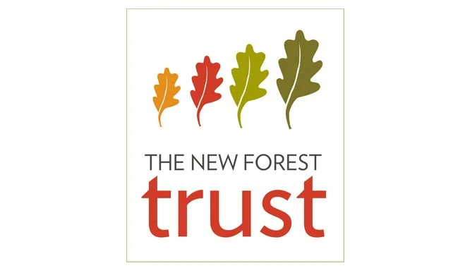
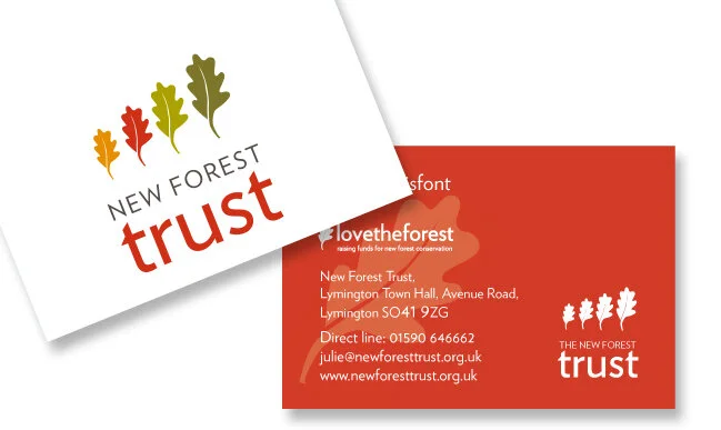
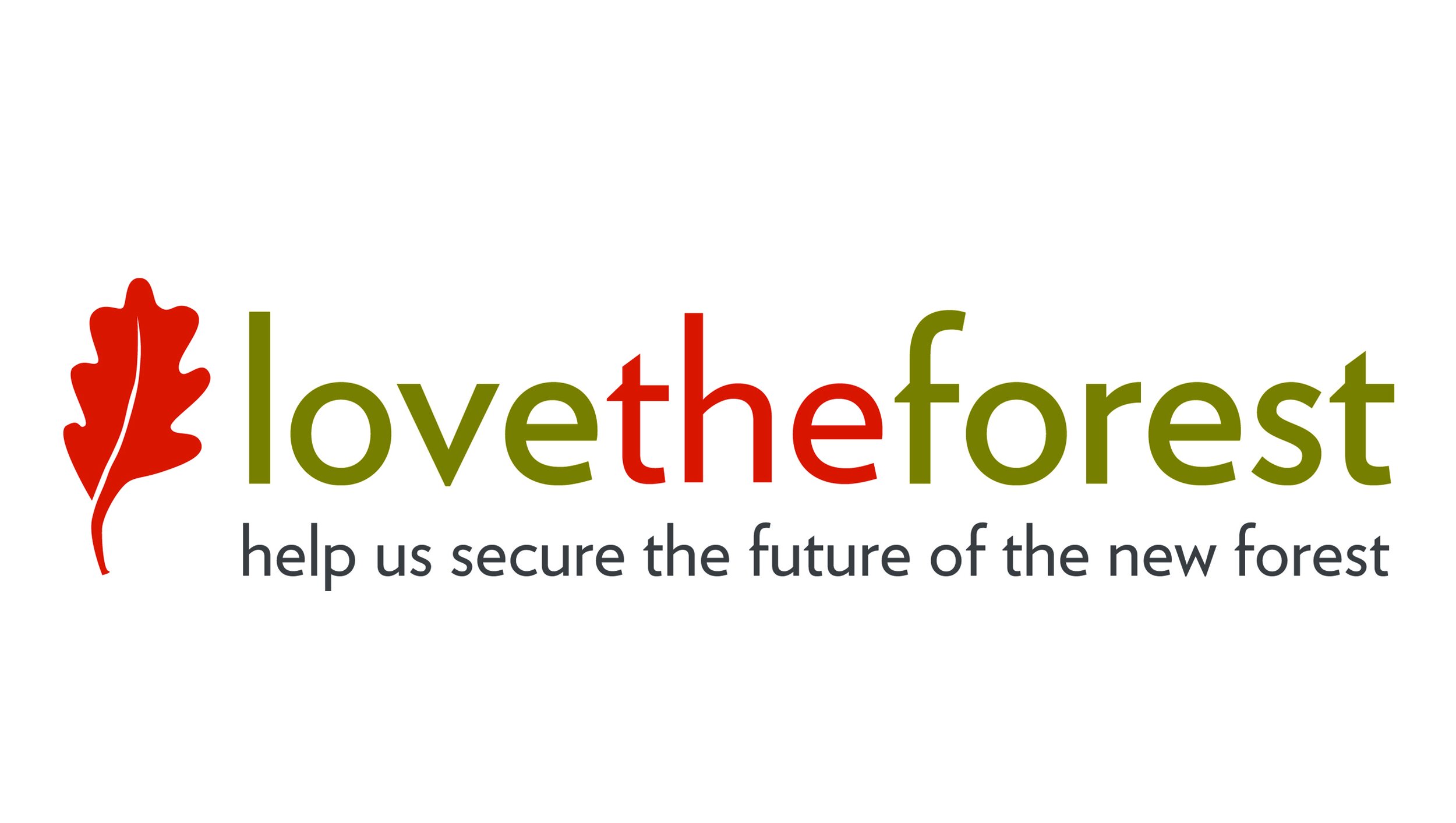
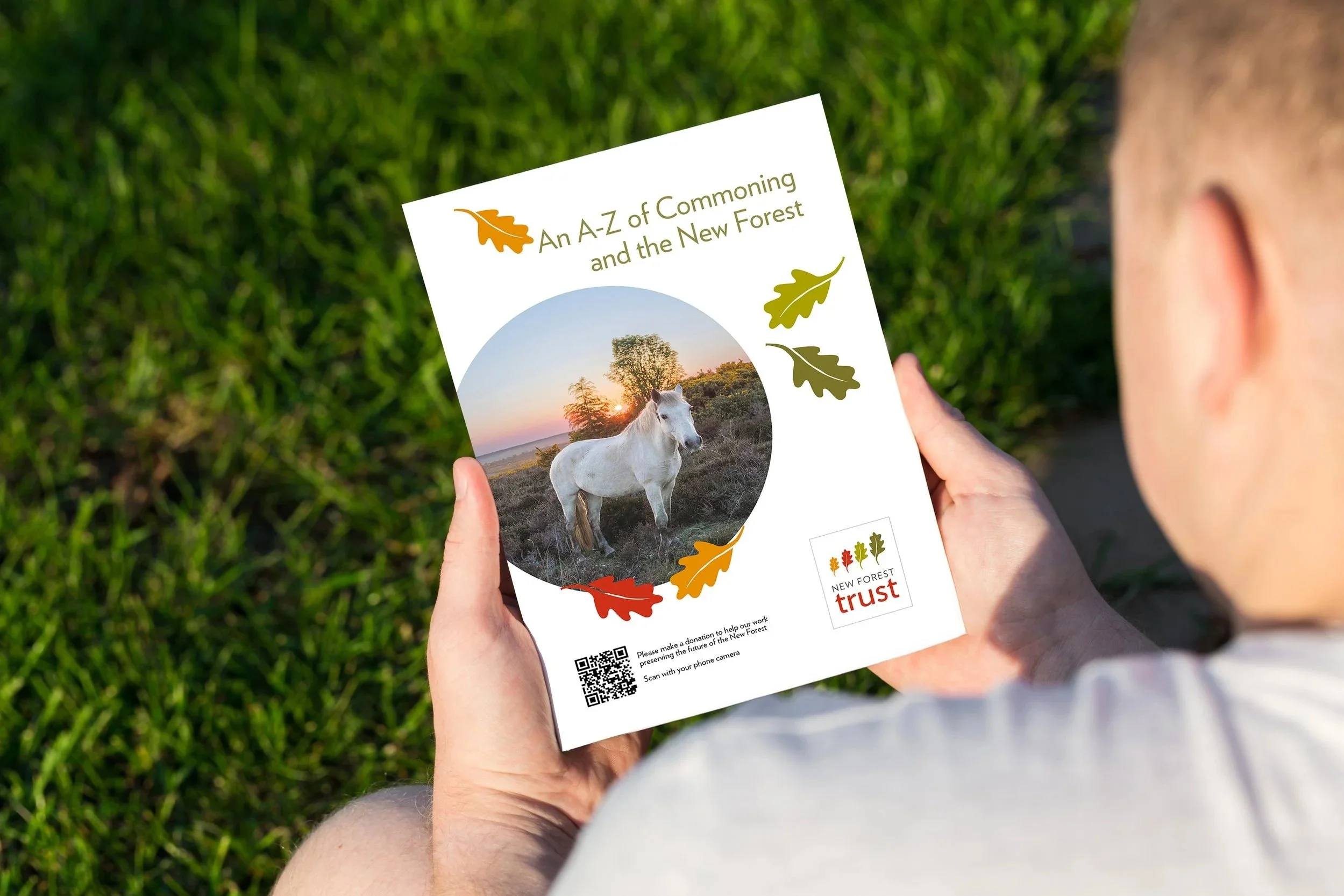
The Trust identity builds from the landscape itself. A palette of rust red, gold, olive and deep green, the colours of the forest floor through the seasons, grounds everything in place before a word is read. Four oak leaves sit at the heart of the mark, moving from the smallest shoot to a full, solid leaf: growth, continuity, stability. And quietly, unmistakably, the word TRUST sits within the logo itself, a gift for a fundraising organisation that needs donors to feel exactly that.
Love the Forest shares the same visual DNA, the palette, the typographic language, the sense of rootedness, but with a lighter touch. Where the Trust identity commands, Love the Forest invites. Together they read as one organisation speaking in two registers.
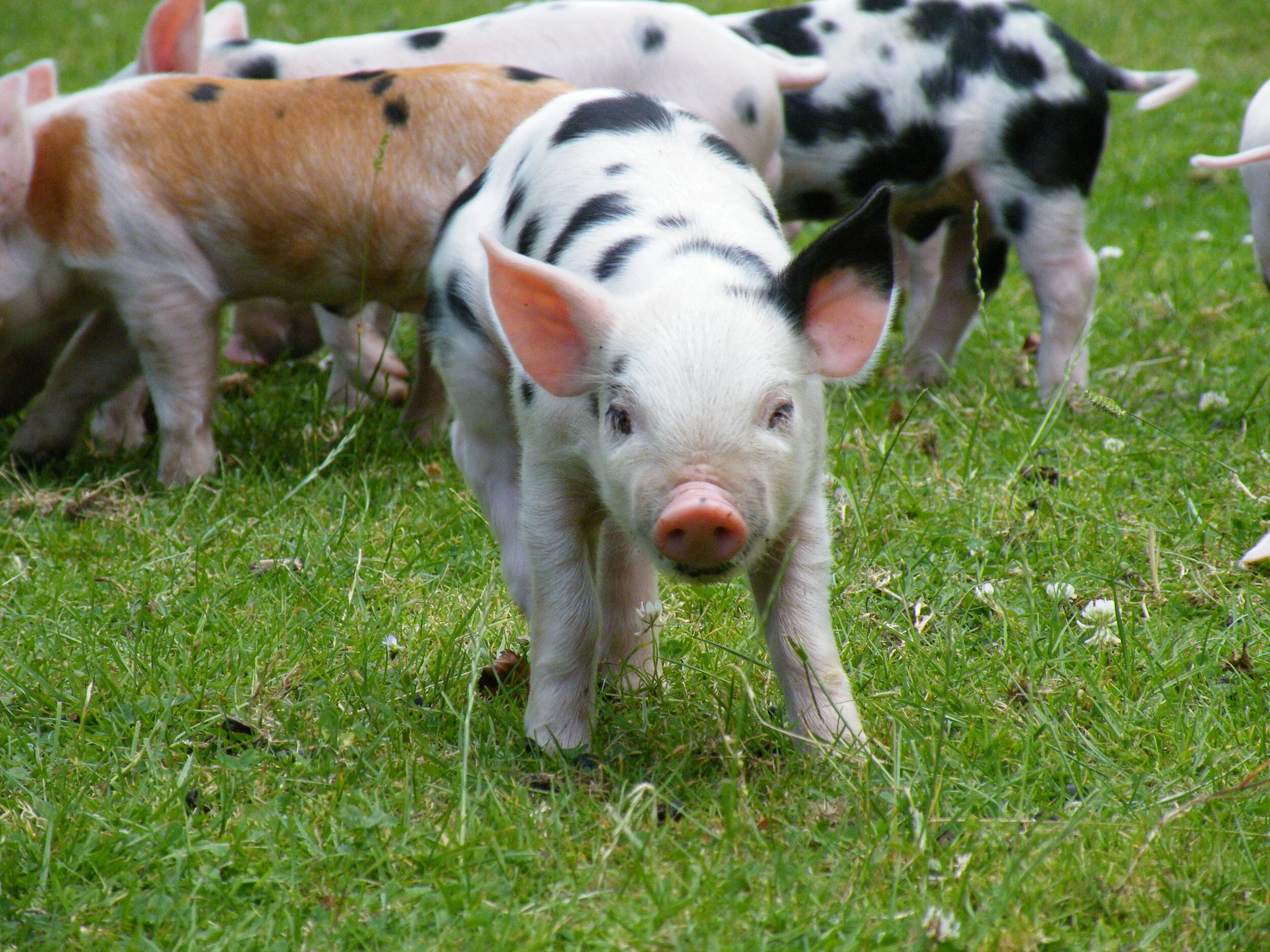
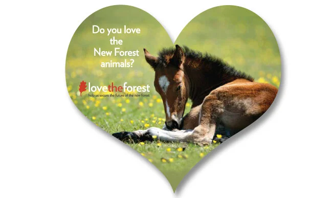
The forest's extraordinary photography did much of the remaining work. This is a landscape with its own ancient laws, its own community, its own way of life, images that capture that carry an emotional weight no illustration can replicate.
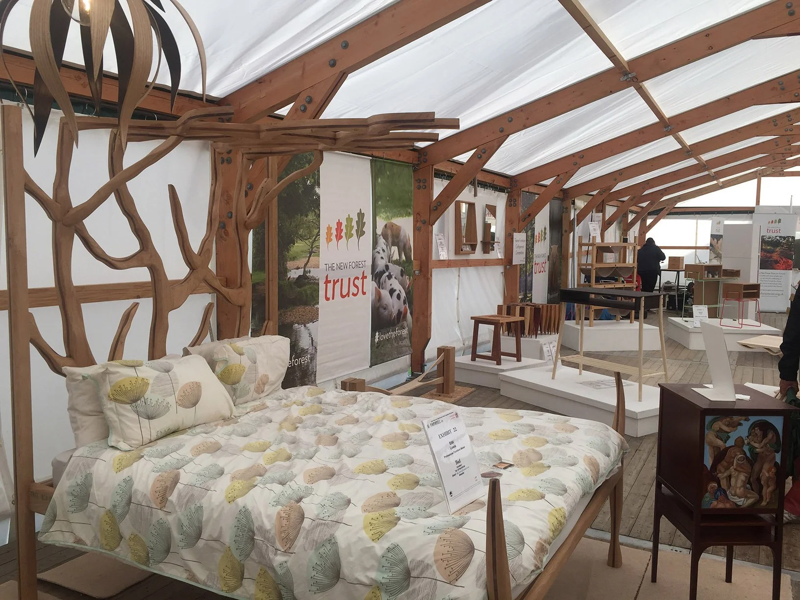
The full application
The identity extended across marketing collateral, exhibition design for the New Forest Show, uniforms, website visuals and printed campaign materials. Most recently, an A-Z of Commoning brochure was produced to educate visitors and supporters about the traditional community whose stewardship of the forest makes all of this possible.