Brand | Website | Print | Uniform
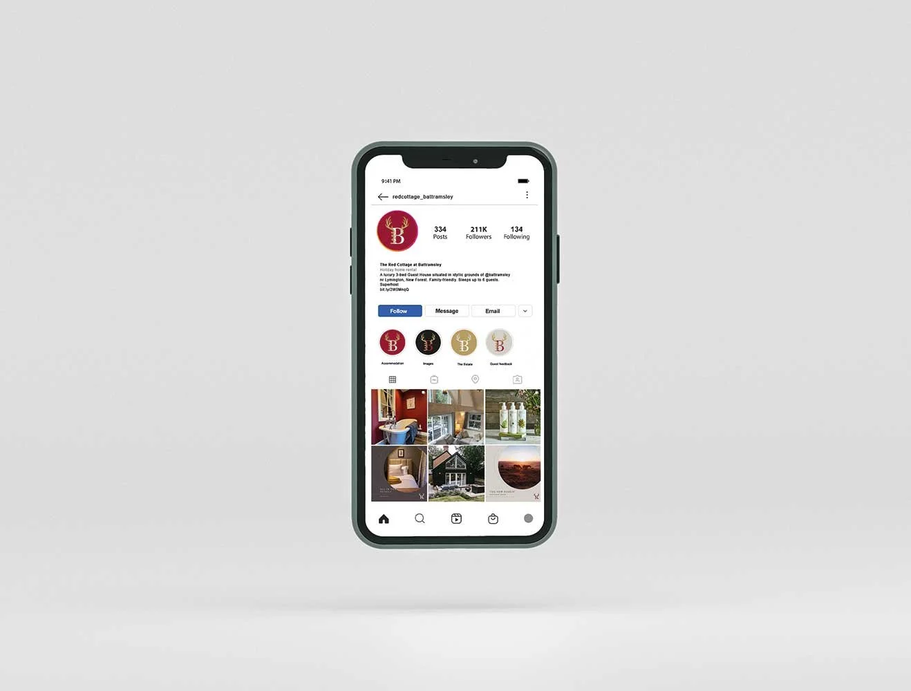
The Red Cottage at Battramsley
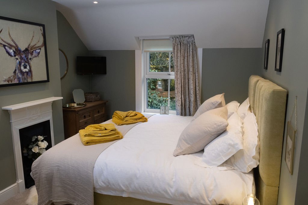
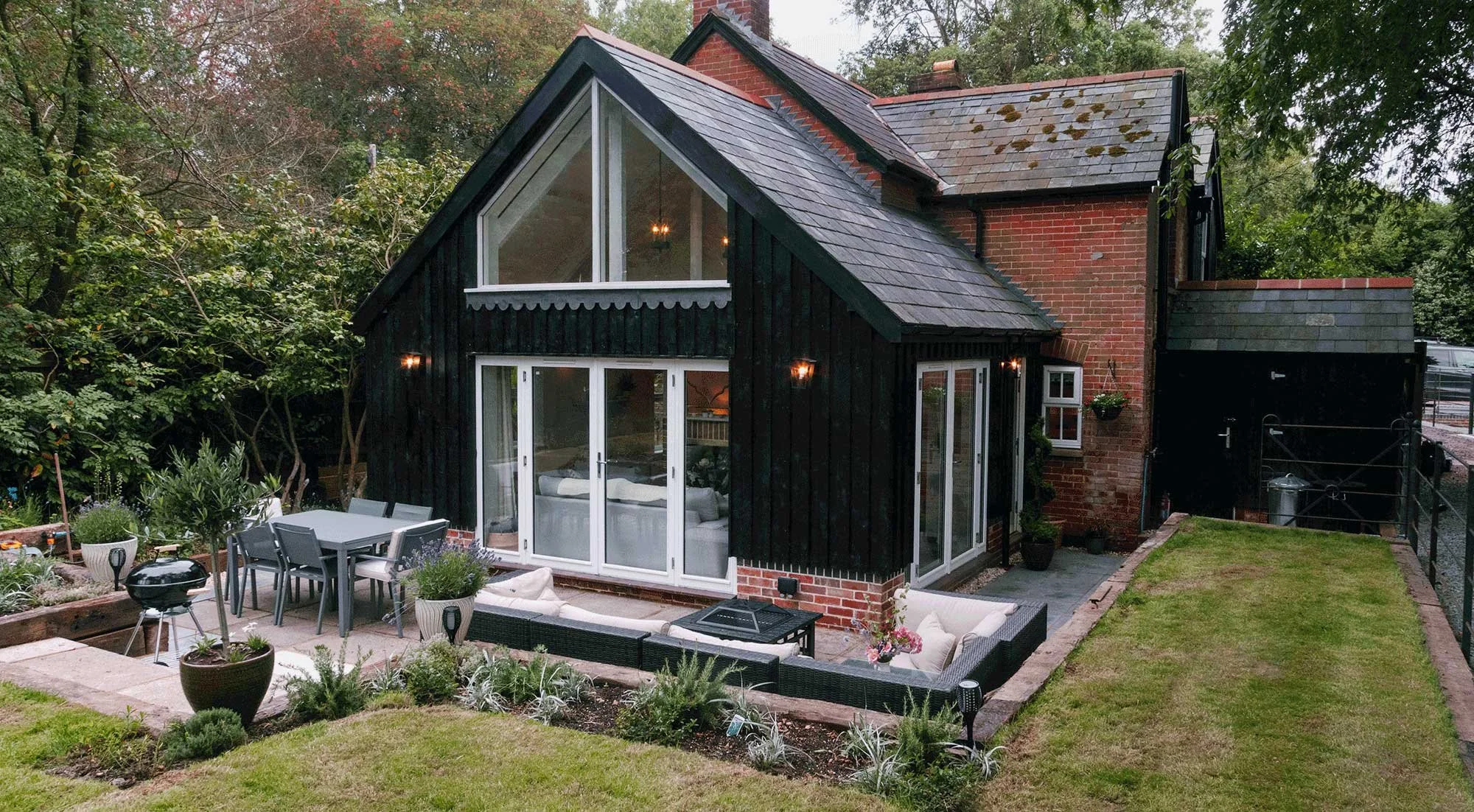
The Red Cottage at Battramsley offers luxury Air B&B accommodation in the grounds of Battramsley House & Estate.
The strategic challenge
A brand as considered as the property itself
What we did: Brand identity · Naming & brand hierarchy · Website design · Print · Clothing · Interior colour & material direction
The design challenge
When your client has a background in design and marketing, the brief is both a privilege and a challenge. Jane Le Maistre knew exactly what she wanted: a beautifully executed identity for Red Cottage, a luxury Air B&B in the grounds of Battramsley House, with the vision to grow into a full estate brand, bar, restaurant, spa, events, all sitting beneath a single, coherent Battramsley identity.
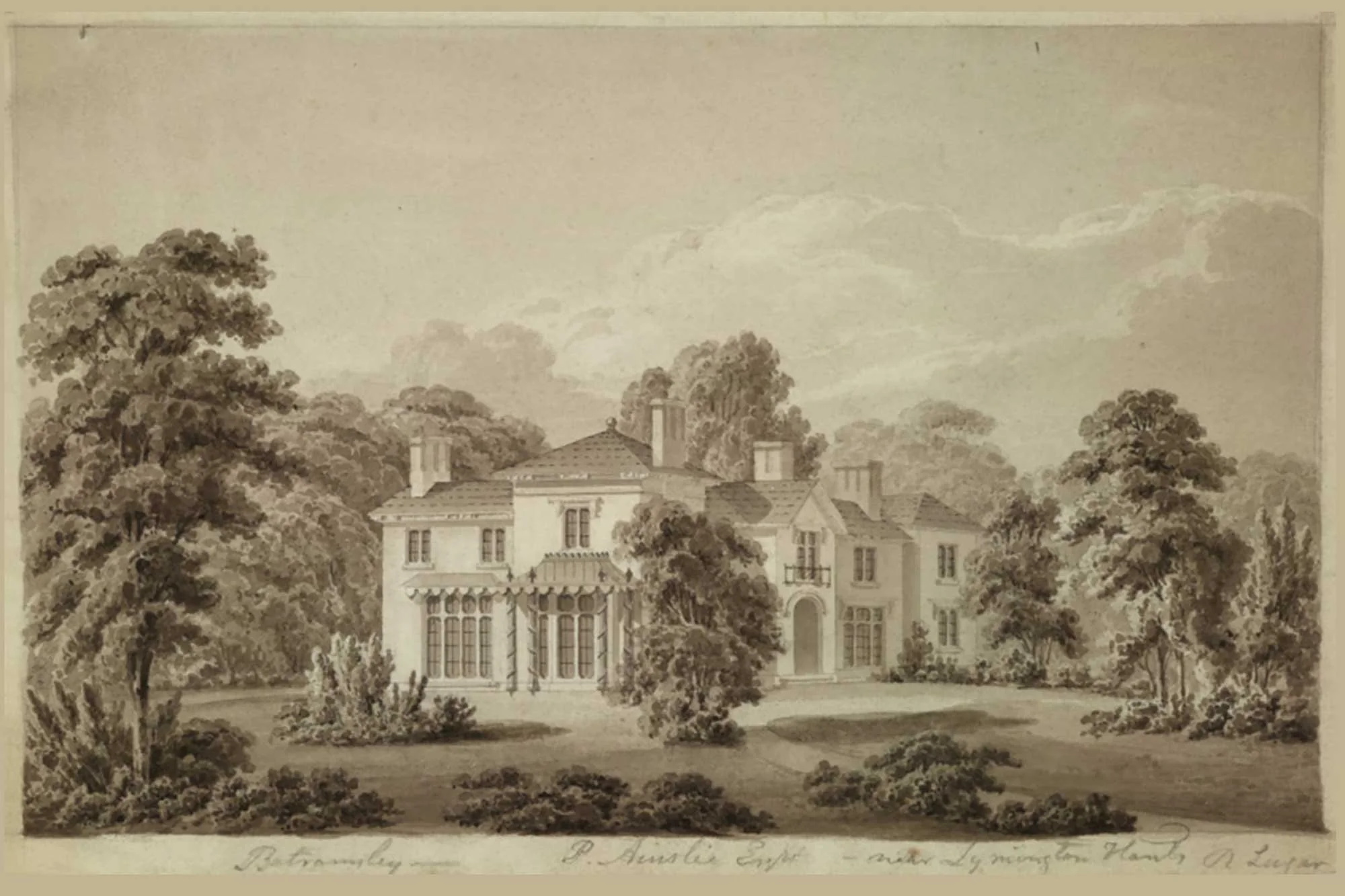
The property demanded a brand with genuine depth. Listed in the Domesday Book of 1086, Battramsley carries history in its bones, and sits in the heart of the New Forest, Henry VIII's hunting ground. The design had to honour that without feeling like a museum piece. It also had to be built for the future: flexible enough to accommodate Battramsley House itself as a hotel, should the family choose to take it in that direction.
What we solved
We started with naming and brand hierarchy, establishing Battramsley as the parent brand and domain, with Red Cottage sitting beneath it as the first of several potential offerings. Getting that architecture right before any visual work began meant the identity could grow with the estate rather than be retrofitted later.
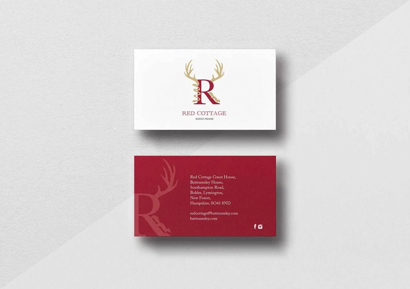
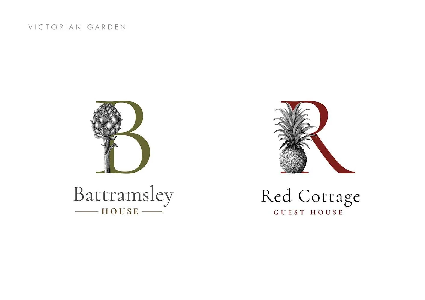
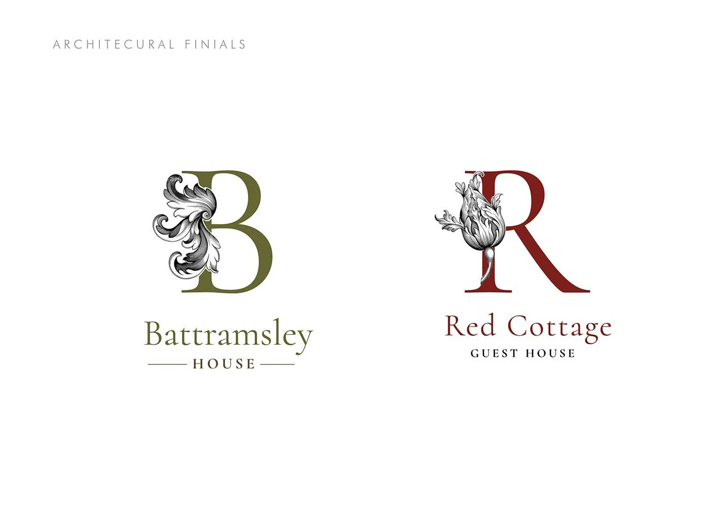
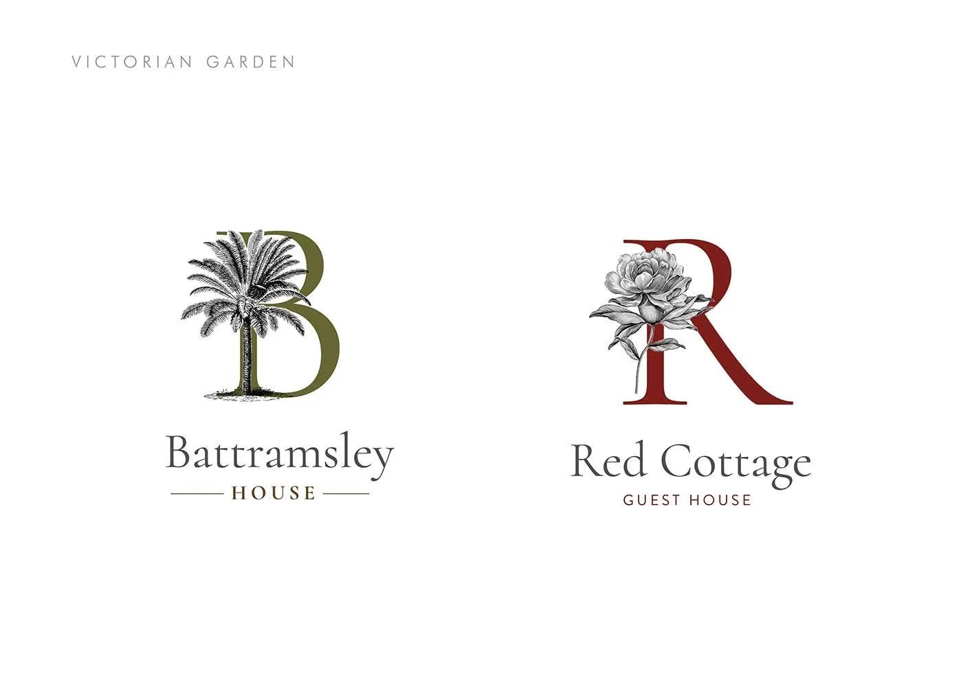
For the visual identity we went back to the source. The first printed edition of the Domesday Book, published in 1783, gave us our typographic starting point. We chose Caslon - William Caslon's enduring classical typeface, warm, authoritative and timeless in equal measure.
The sensory detail
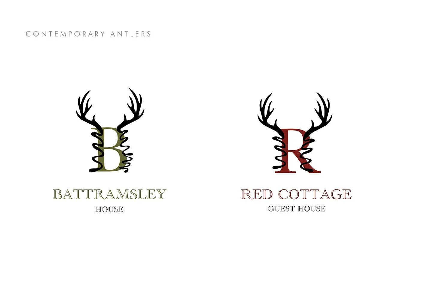
The New Forest location gave us our contemporary twist. Modern antlers wrap around the R of Red, a nod to the estate's royal hunting history that feels fresh rather than folkloric, and creates a visual device that could extend naturally to the main house should it ever open as a hotel.
The brief went beyond identity into the full guest experience. Interiors, colours, styling and visual language were considered togethe, everything working cohesively so that Red Cottage feels like a home from home the moment you arrive, not a rental property that happens to look nice online.
Paint colours and material choices were made with the same rigour as the print stocks: weighted papers, gold highlights, nothing accidental. The brand extends seamlessly from the Air B&B listing to the welcome card on the kitchen table.