Brand | Interior | Graphic Design
Bagels by Soho
The strategic challenge
From concept to café, a brand built from the inside out
What we did: Naming · Brand identity · Interior & exterior design · Signage · Packaging · Uniforms · Menus · Print · Digital & social media · Brand guidelines
The design challenge
Chris Rice trusted us with something unusual. Not just the brand, the entire vision. Before a name was chosen or a logo sketched, we were walking potential premises together, reading the footfall, feeling the space, asking whether this was the right place for the concept we had in mind. It was the Blue Walnut process at its most complete: strategy before design, and design before a single thing was built.
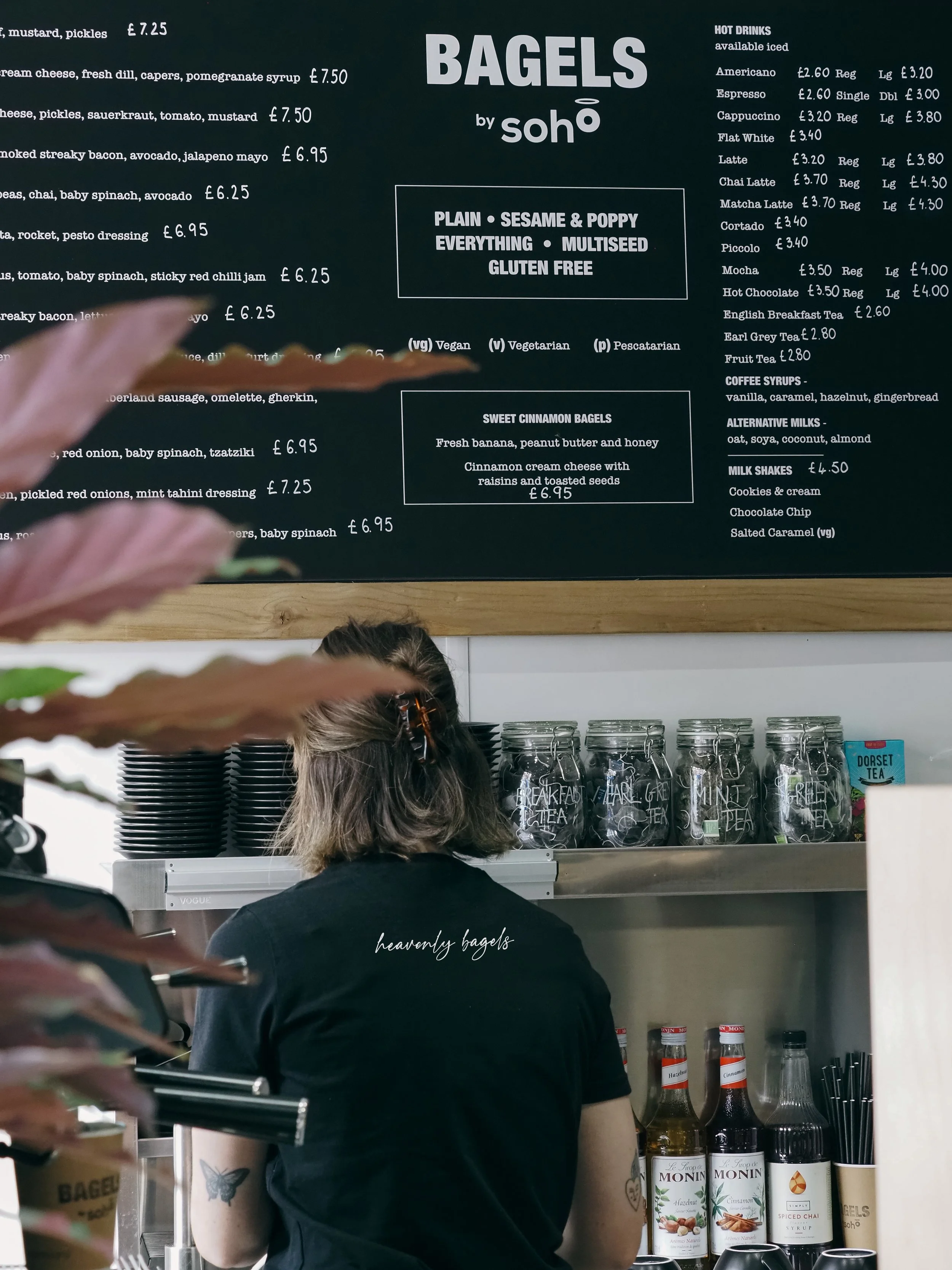
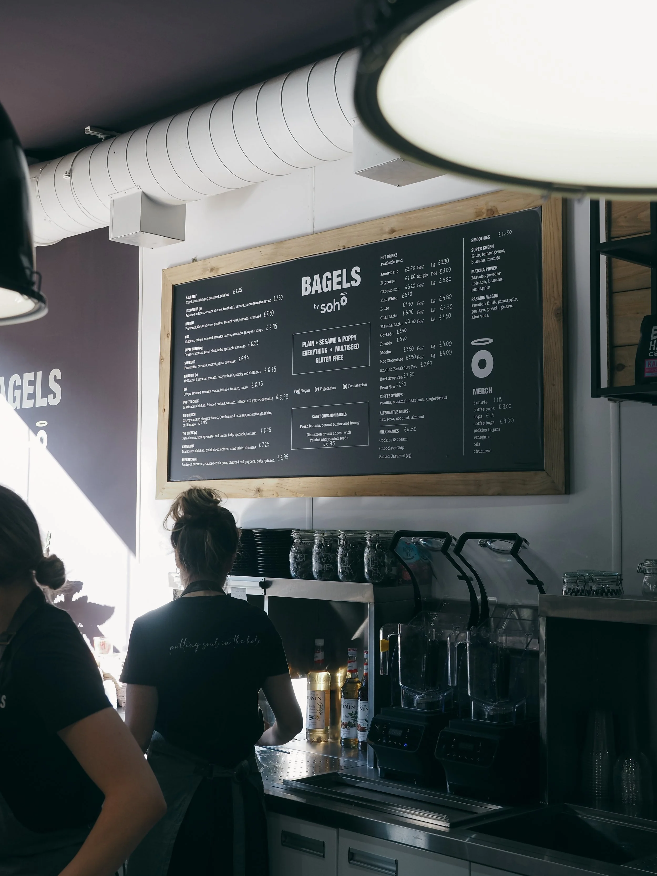
The brief was a daytime bagel shop, eat in, take away, delivery, built on sustainable local ingredients, locally ground coffee by Bad Hand, and the kind of considered, unhurried experience that makes people come back every morning.
What we solved
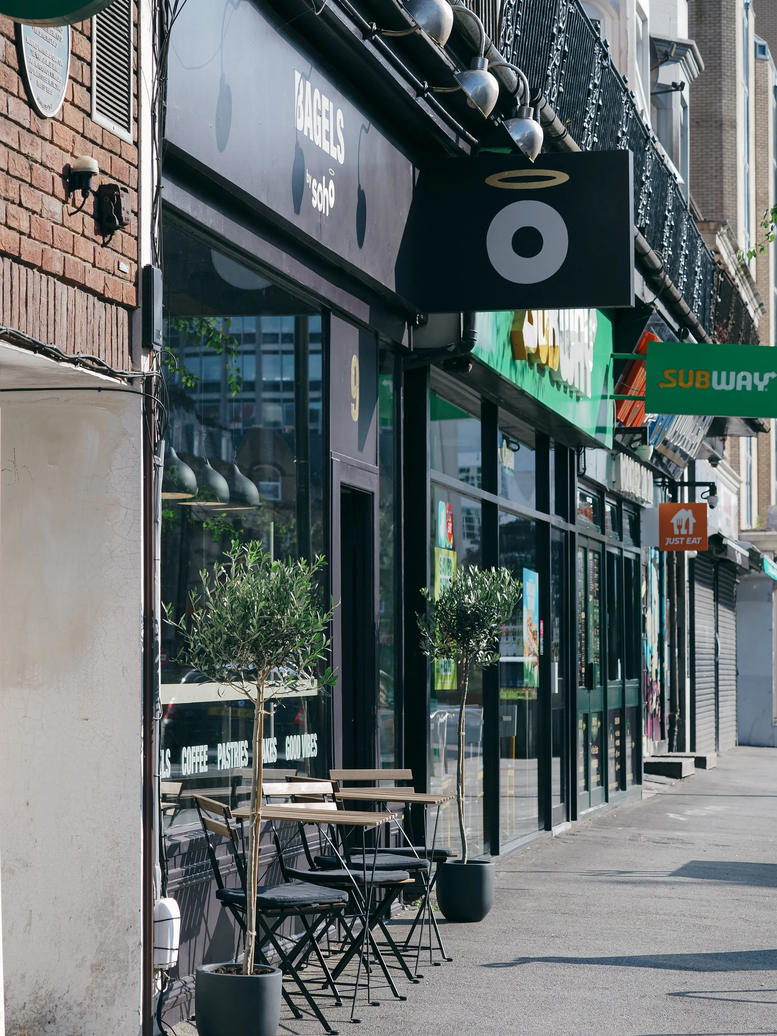
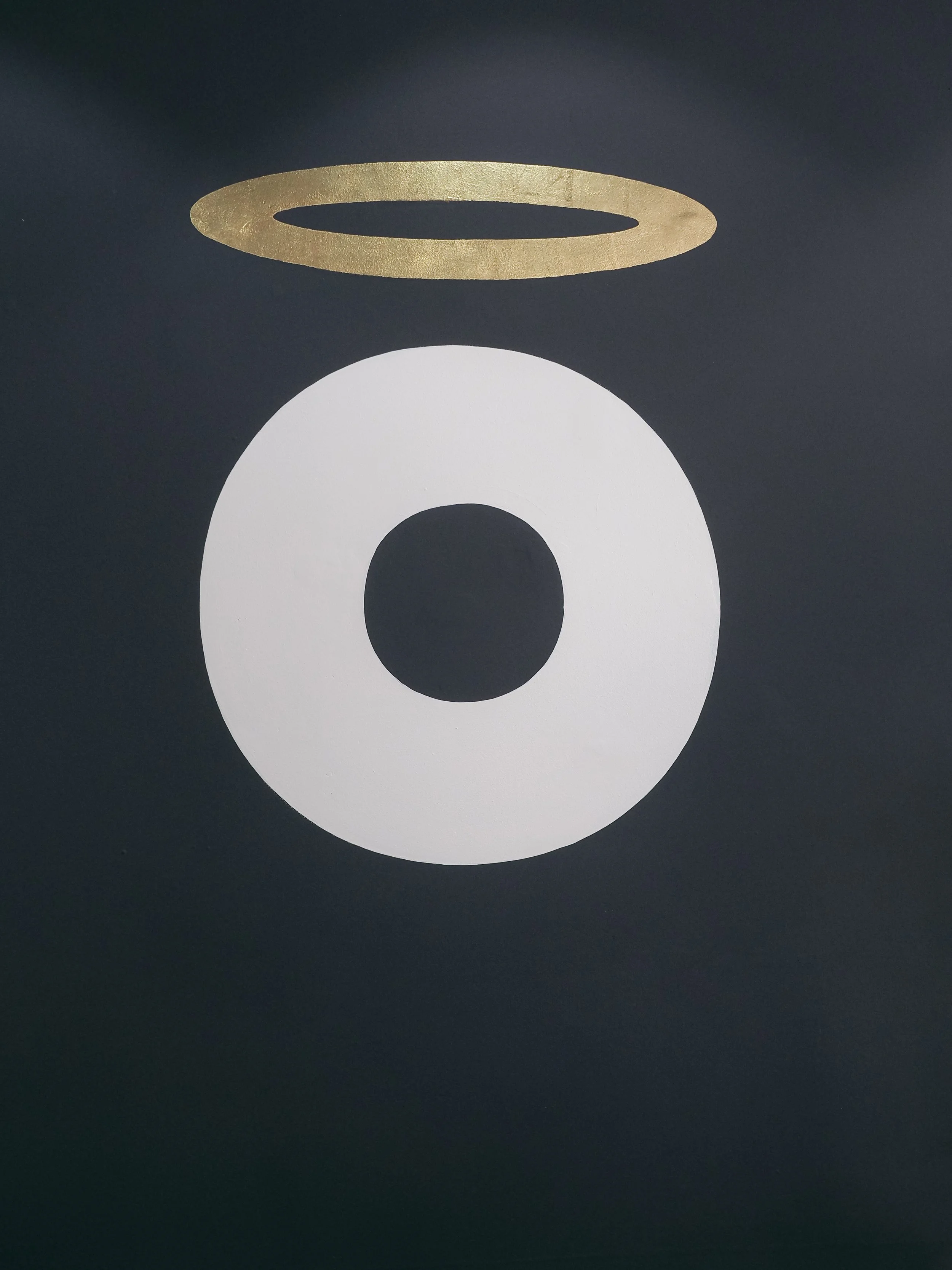
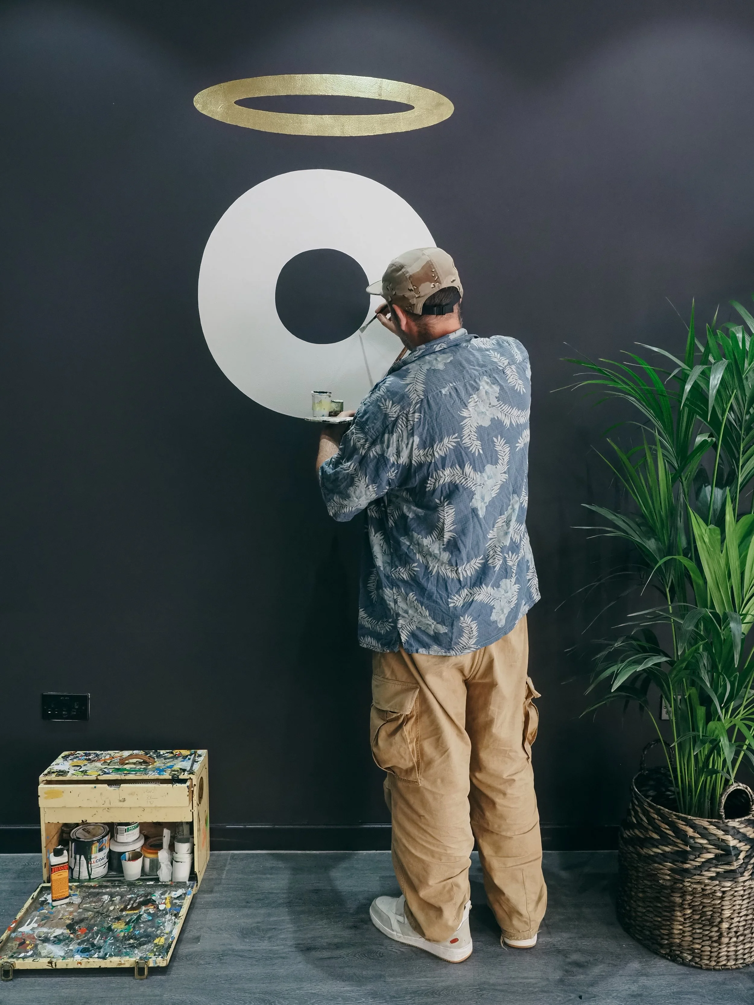
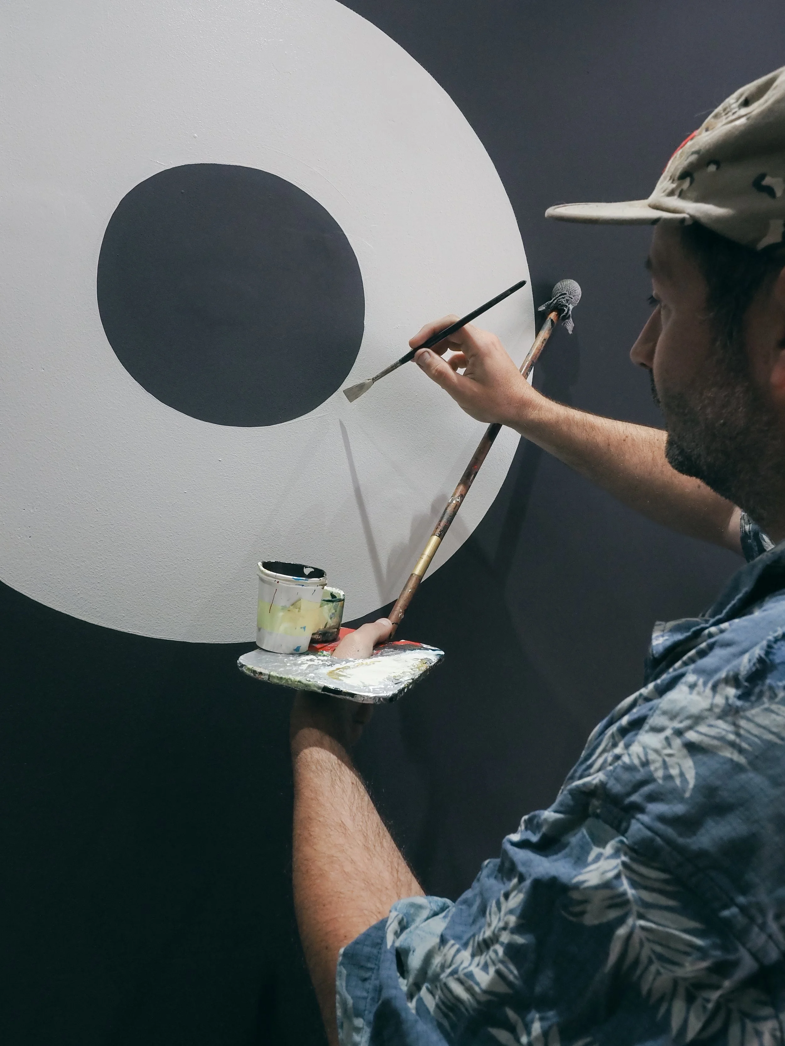
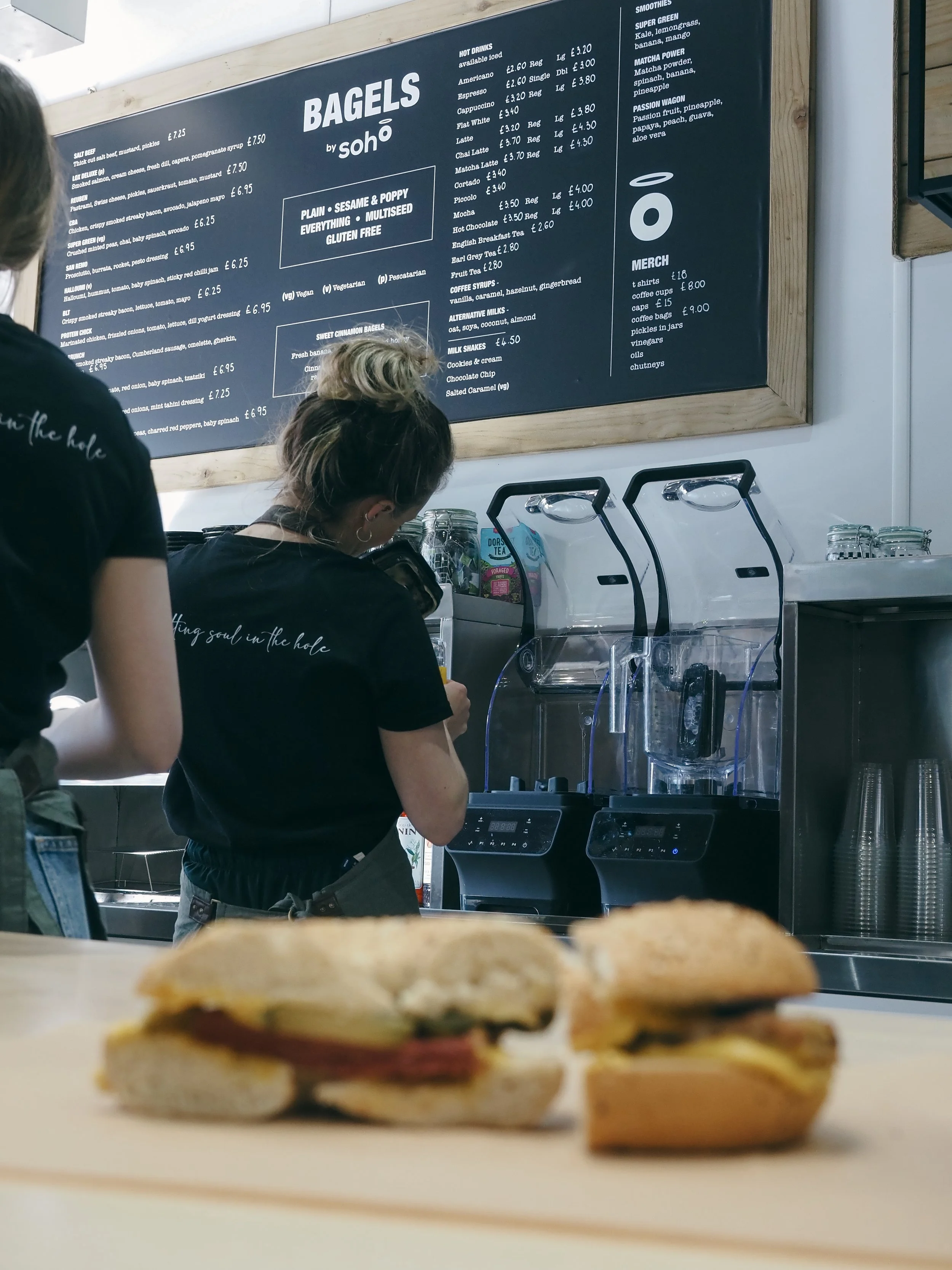
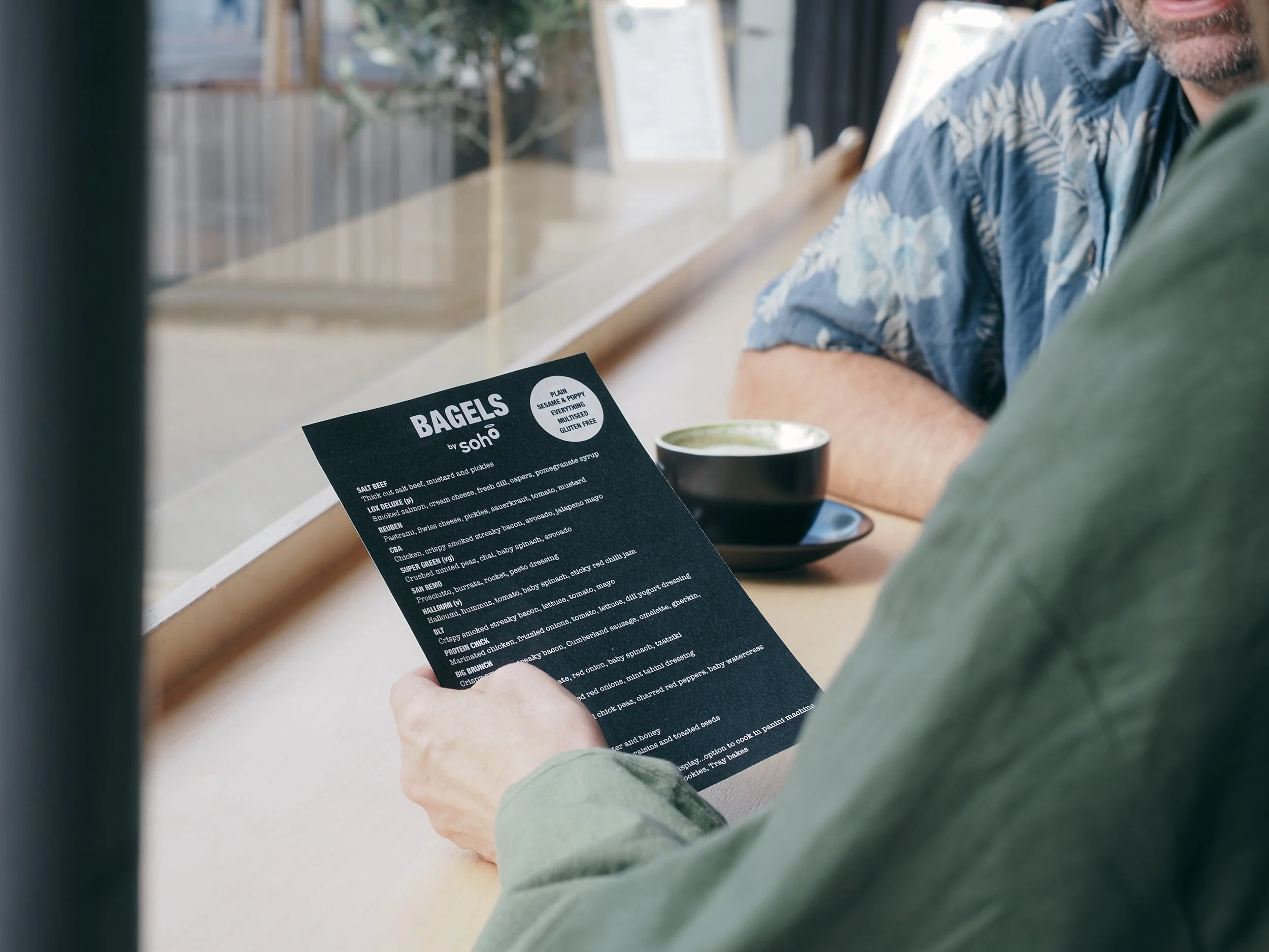
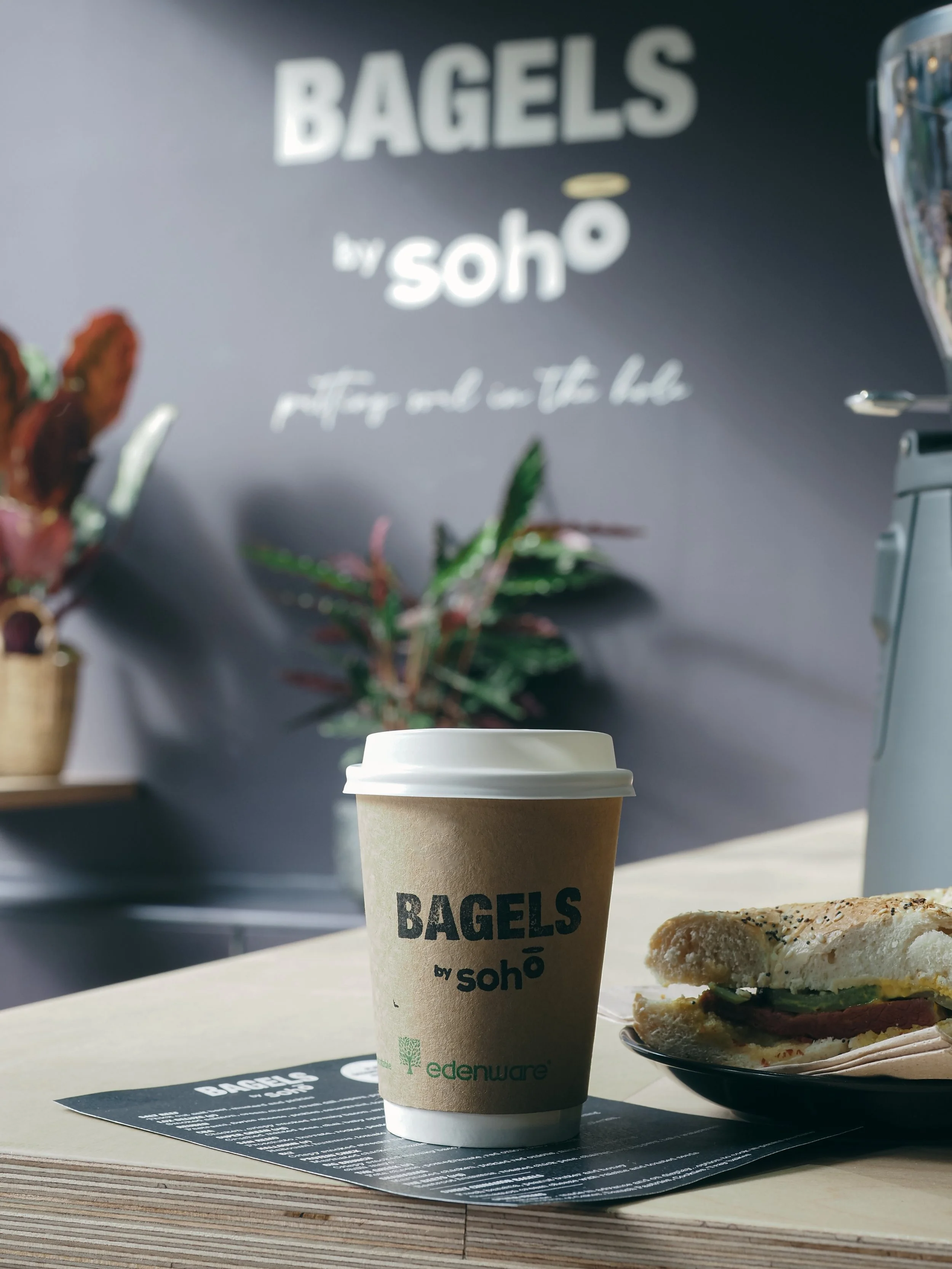
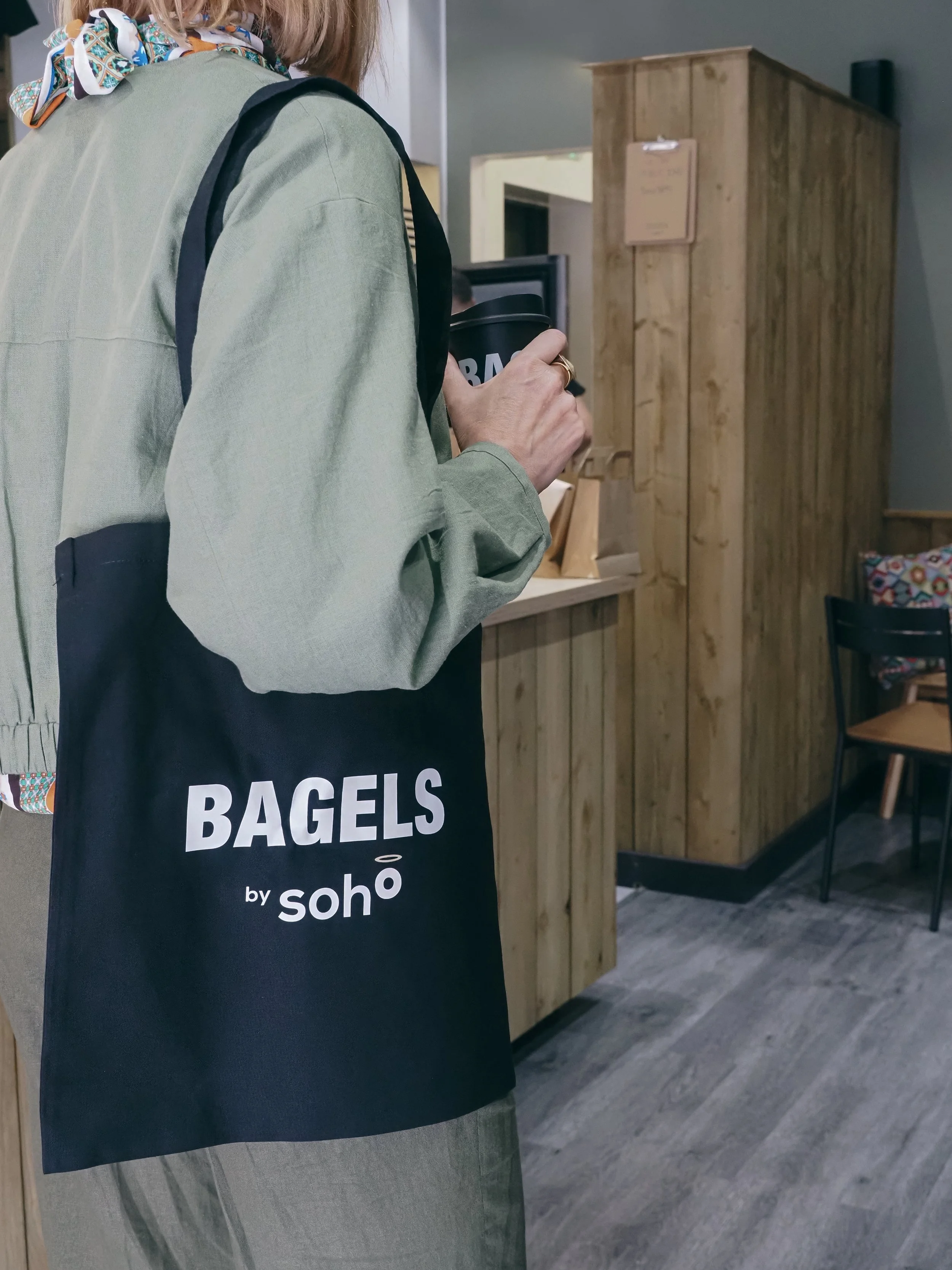
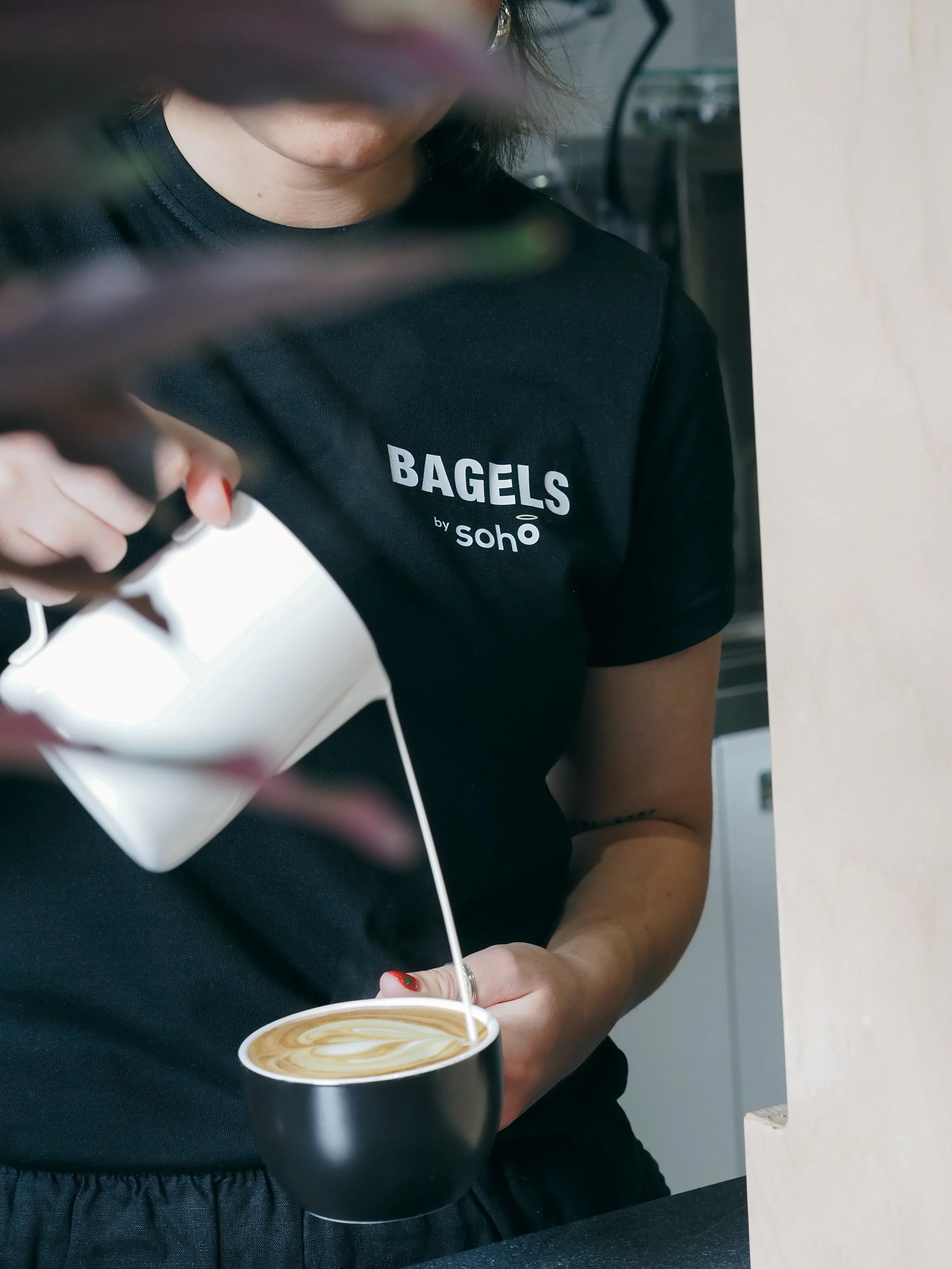
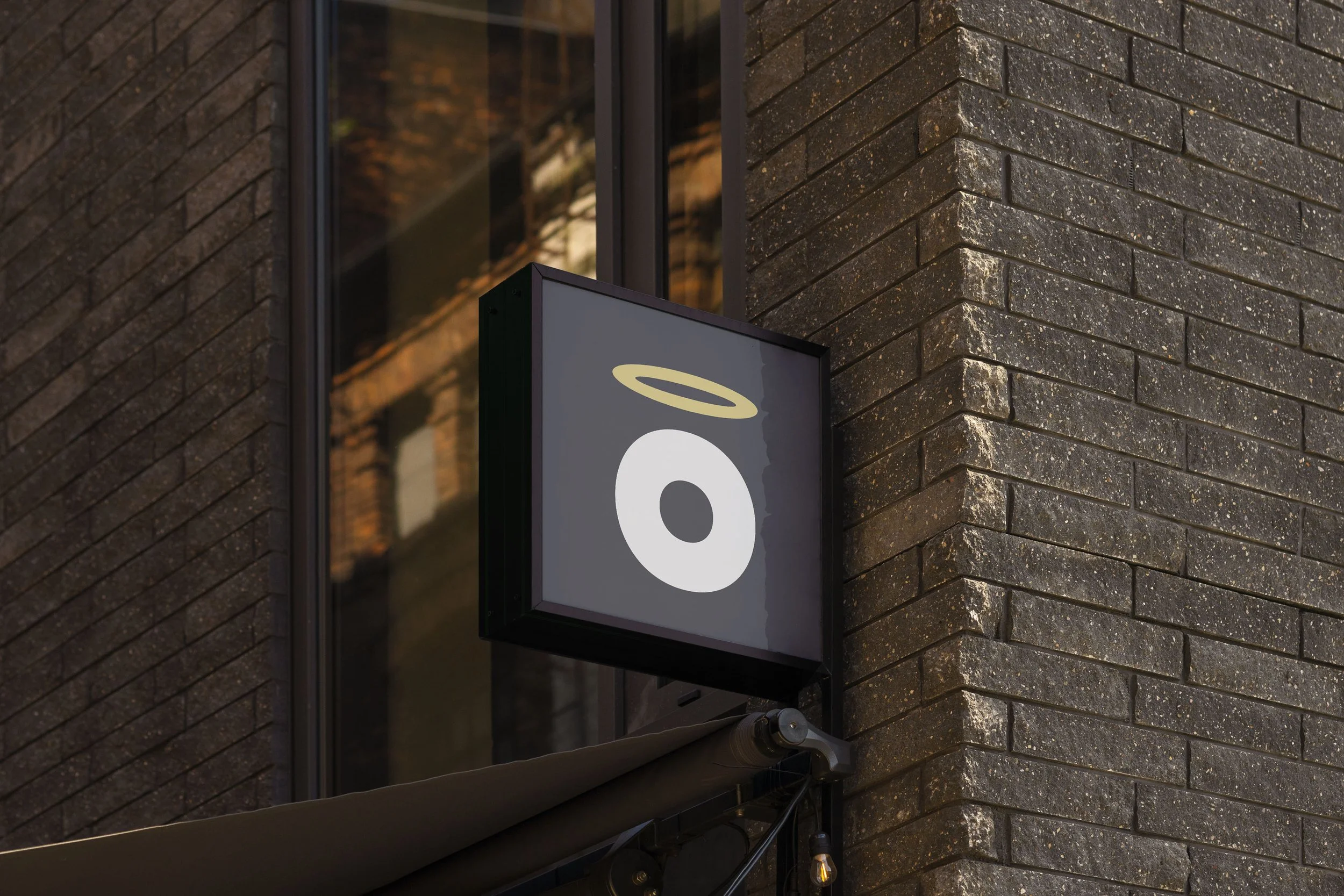
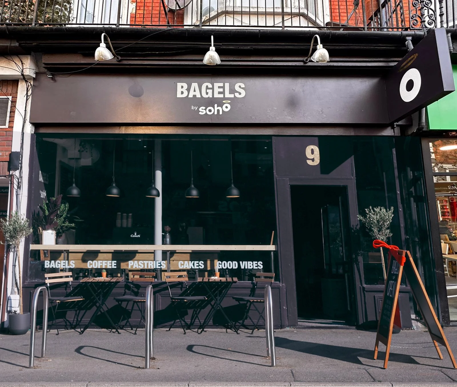
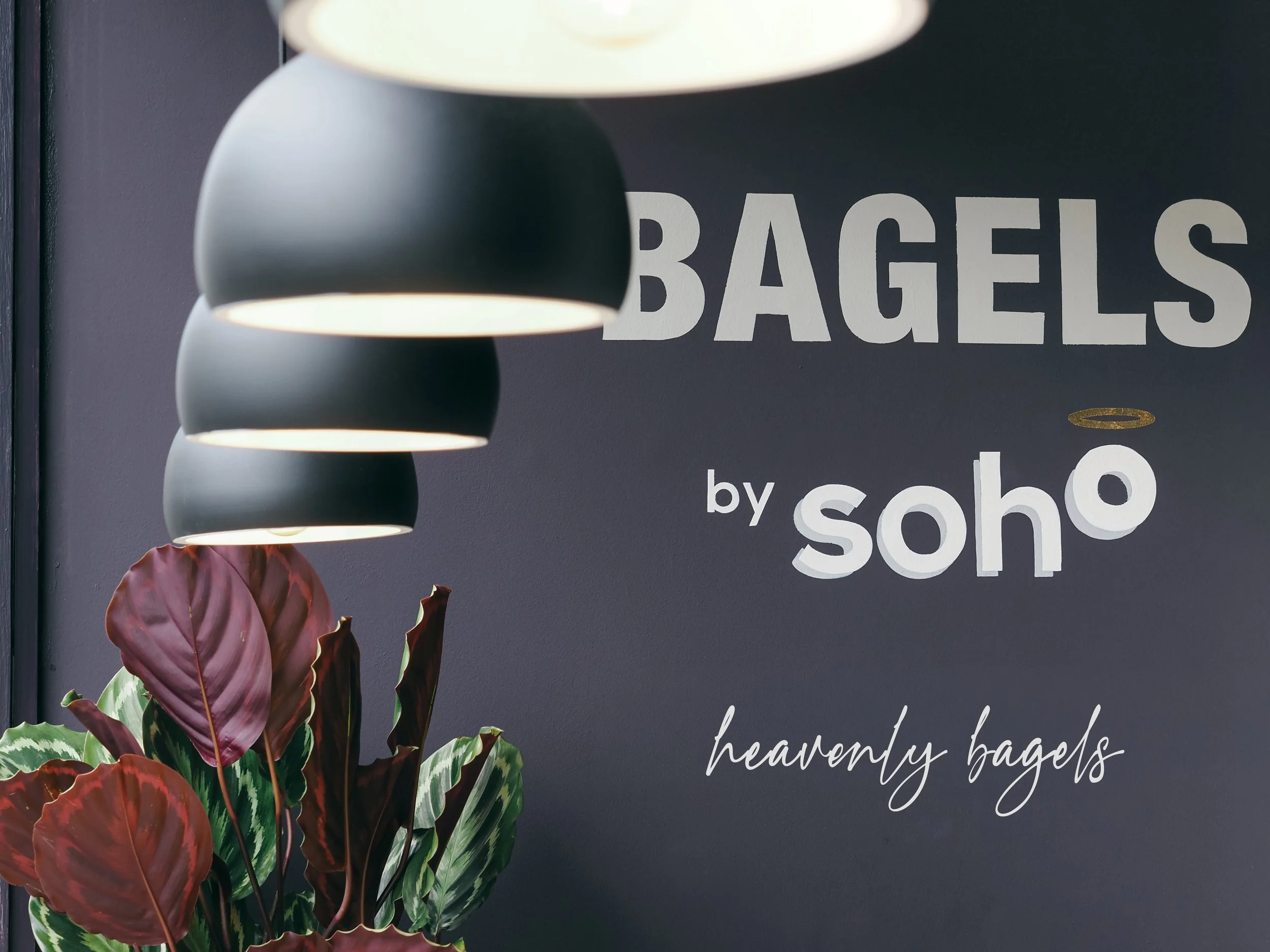
The name came first and it unlocked everything. Bagels by Soho borrowed equity from Chris's existing Soho Bar and Restaurant, using an established local audience as a launchpad for an entirely new concept. But the name did something more, it gave us the O.
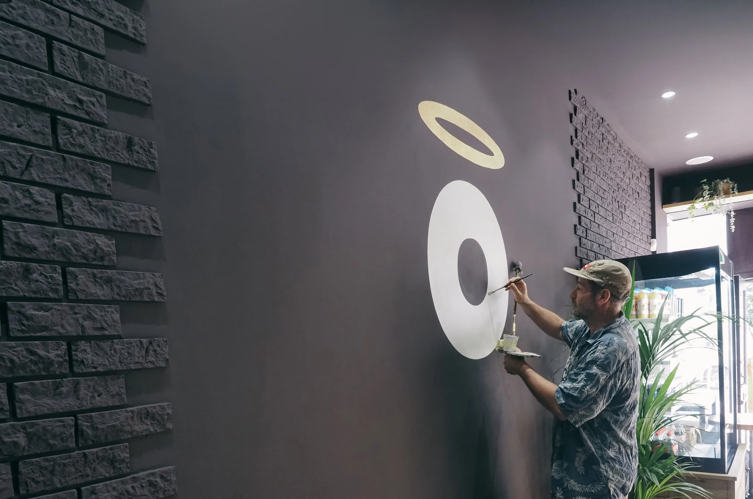
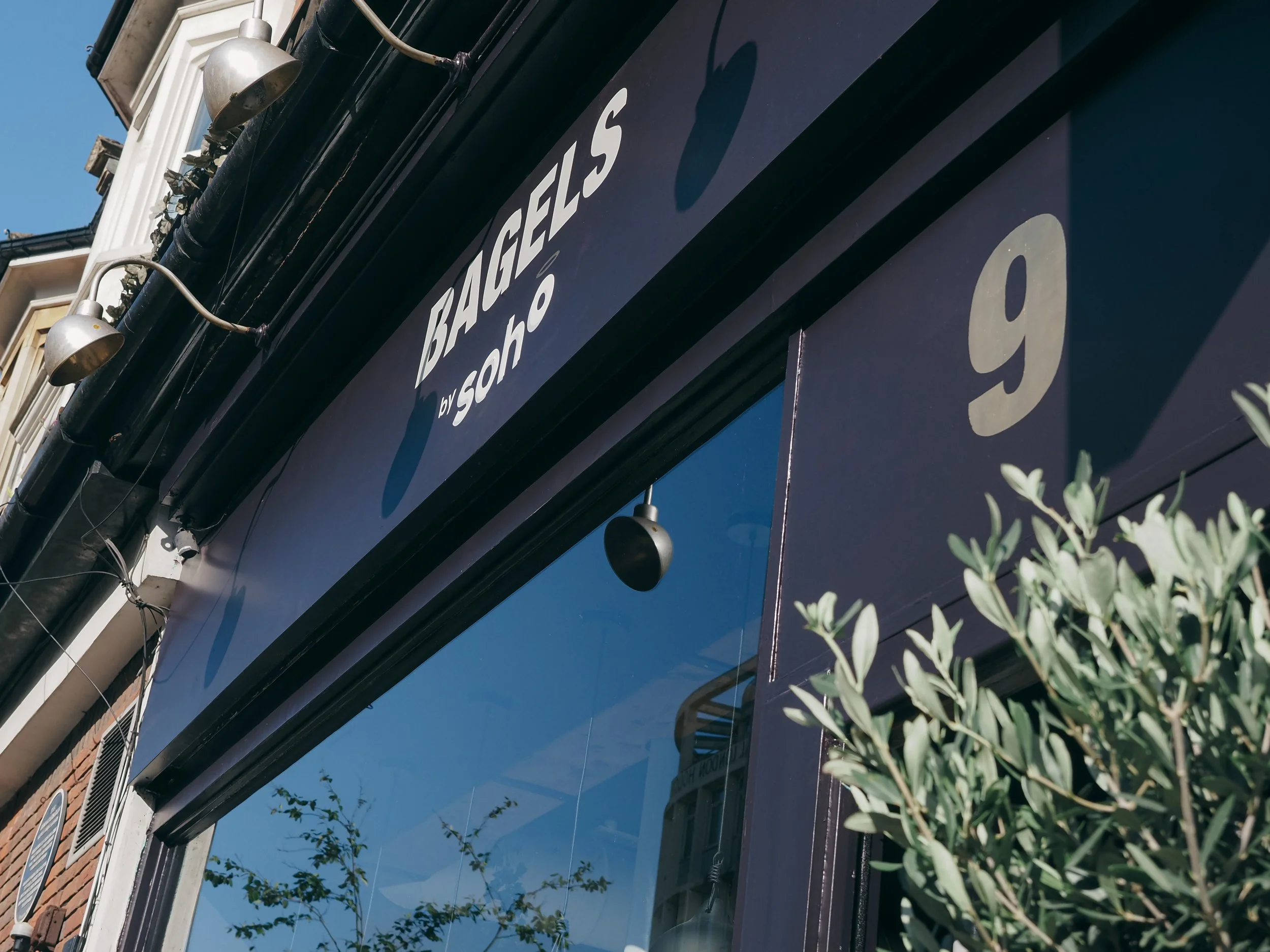
The typeface we chose had a perfectly circular O, the shape of a bagel with a hole. We lifted the final O from the baseline so it appeared to rise, then drew a fine halo above it. The strapline , heavenly bagels, followed naturally. A simple, idea that worked at every scale, from a loyalty card to the full building fascia.
That fascia was hand-painted by local lettering artist Steve Blackwell, with the halo rendered in gold leaf inside the café, a detail that gave the whole space a handcrafted warmth that no printed sign could replicate.
The sensory interior
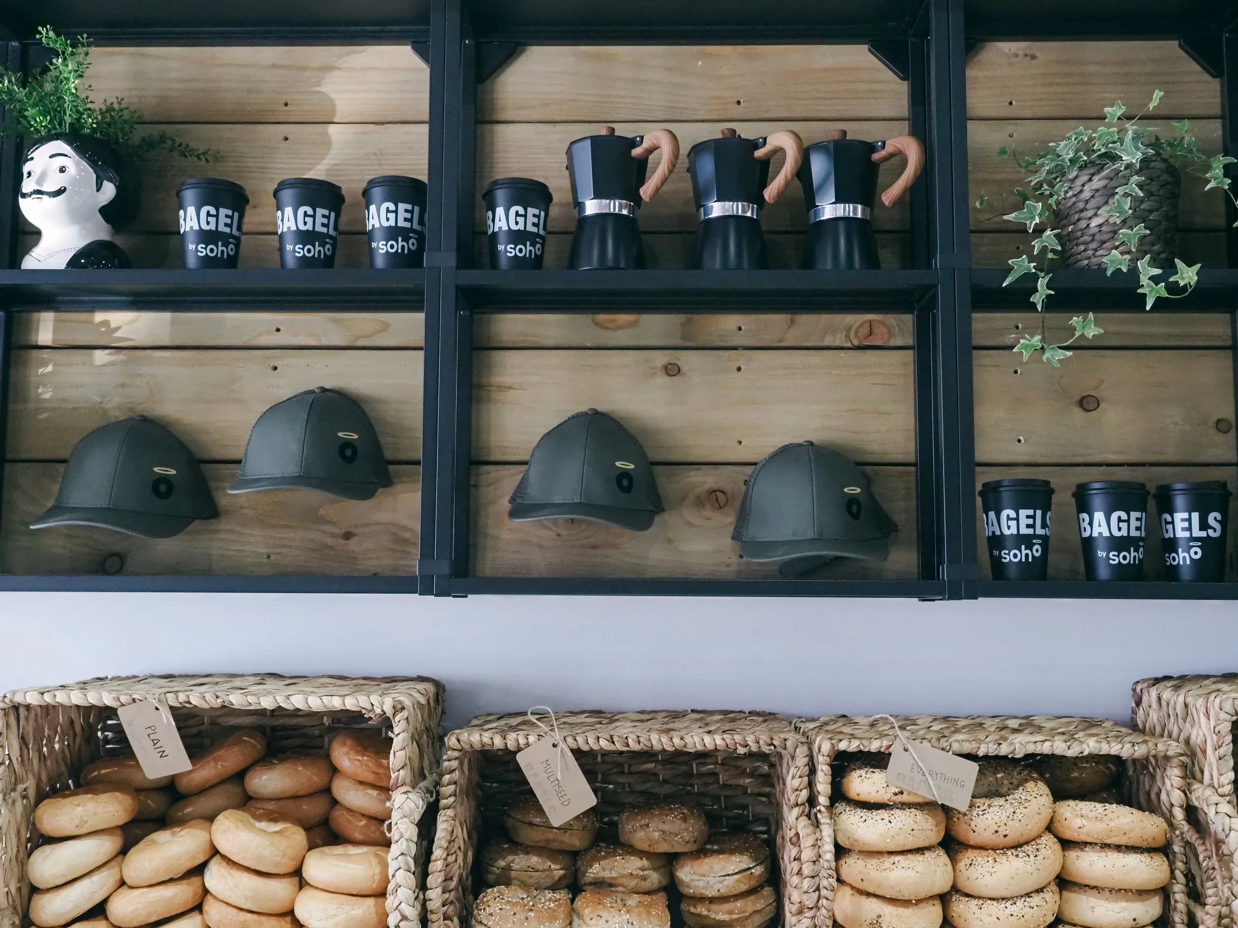
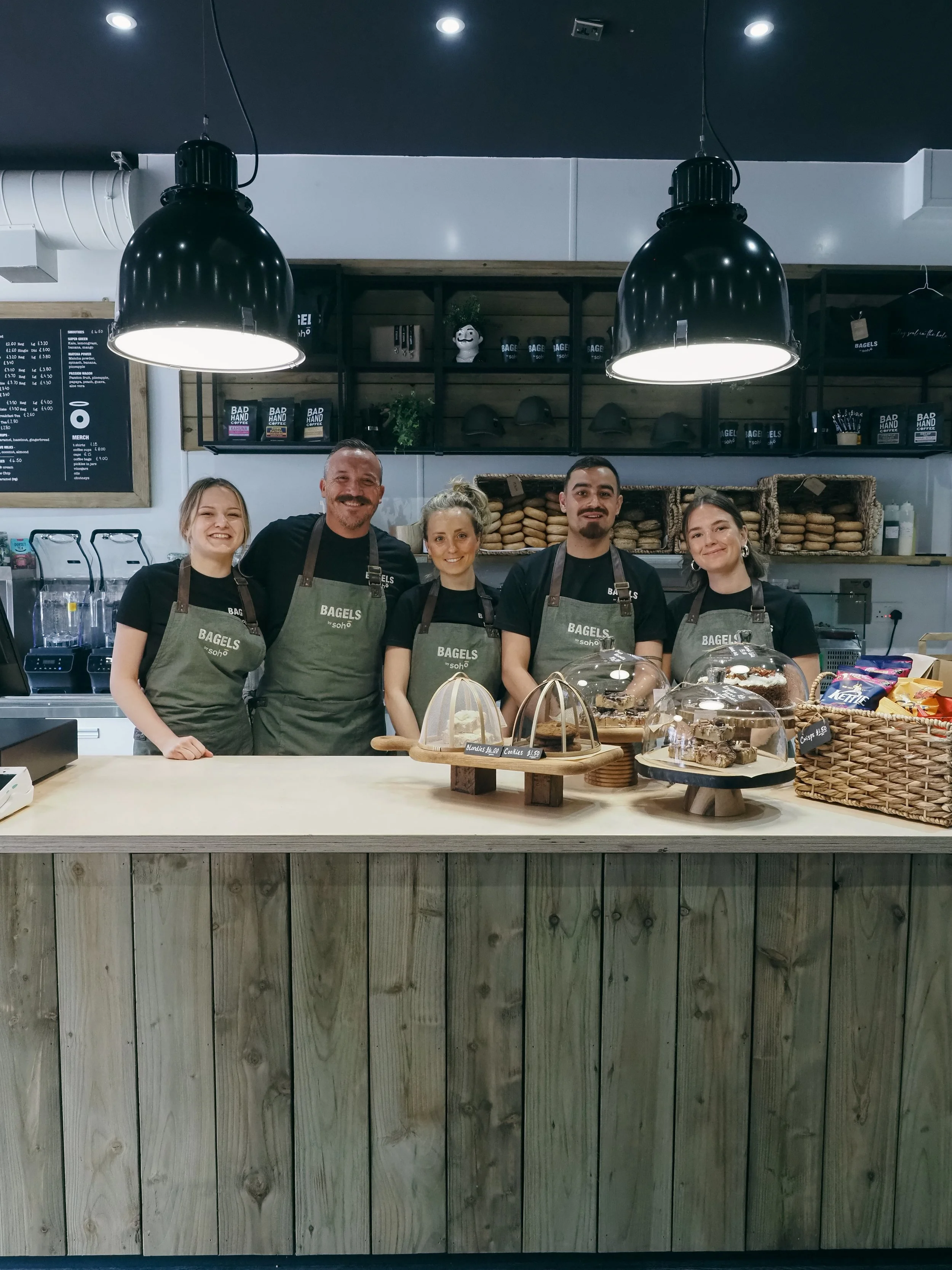
The colour was Farrow & Ball Paean Black, a deep, vintage, aubergine-tinged black that became the brand's most distinctive asset. It took courage from Chris to trust it, particularly after the first coat. But carried through inside and out, it created a calm, considered canvas: dark and artisan, with hanging enamel pendant lights and a back wall in olive green echoed by the olive trees and planting throughout the space.
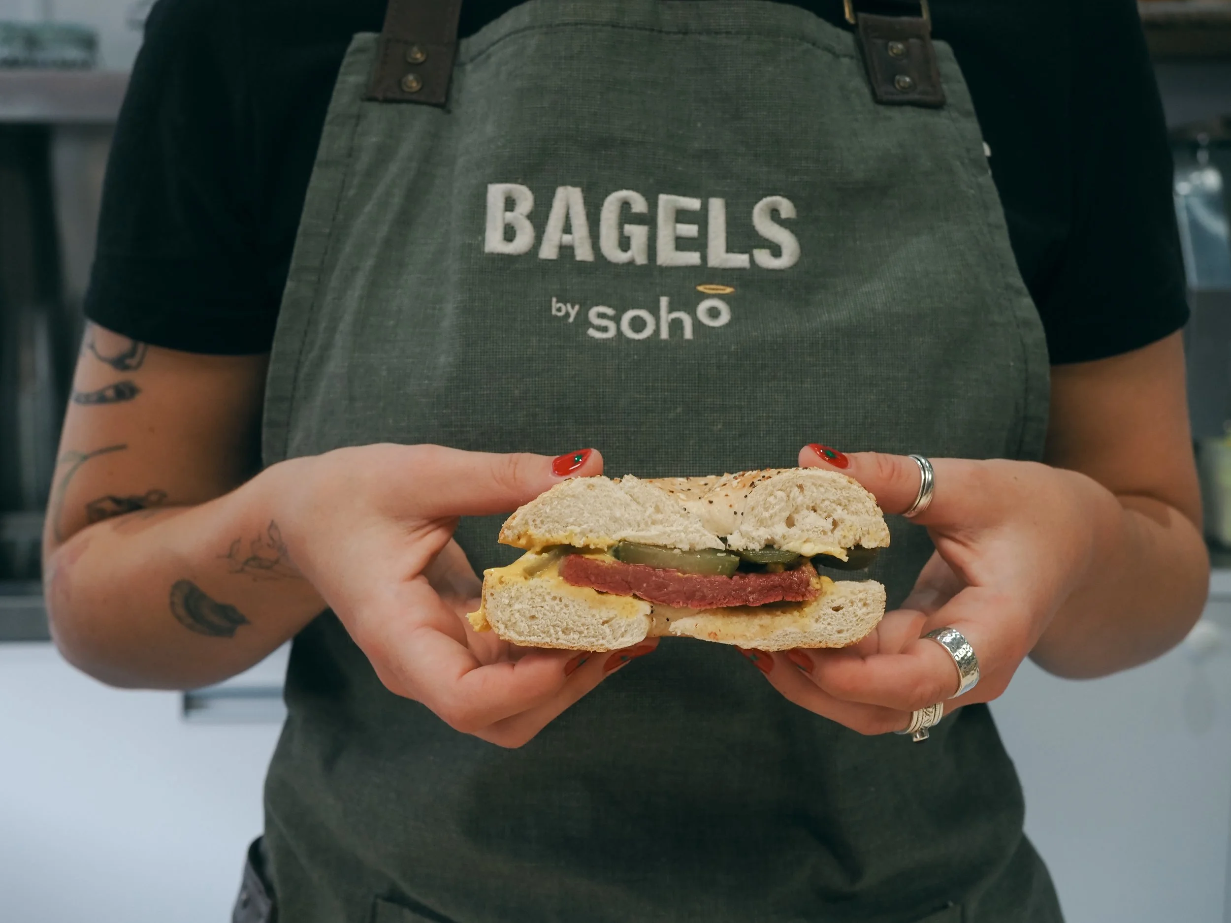
Everything in the interior was considered as part of the brand. Sustainability ran through the materials as well as the menu, recyclable packaging for bagels and coffee, local suppliers throughout. Even the brand stamping was done by hand using an inked stamp made by English Stamp in Dorset, giving every piece of packaging a human touch that perfectly matched the handcrafted ethos of the café.
The full application
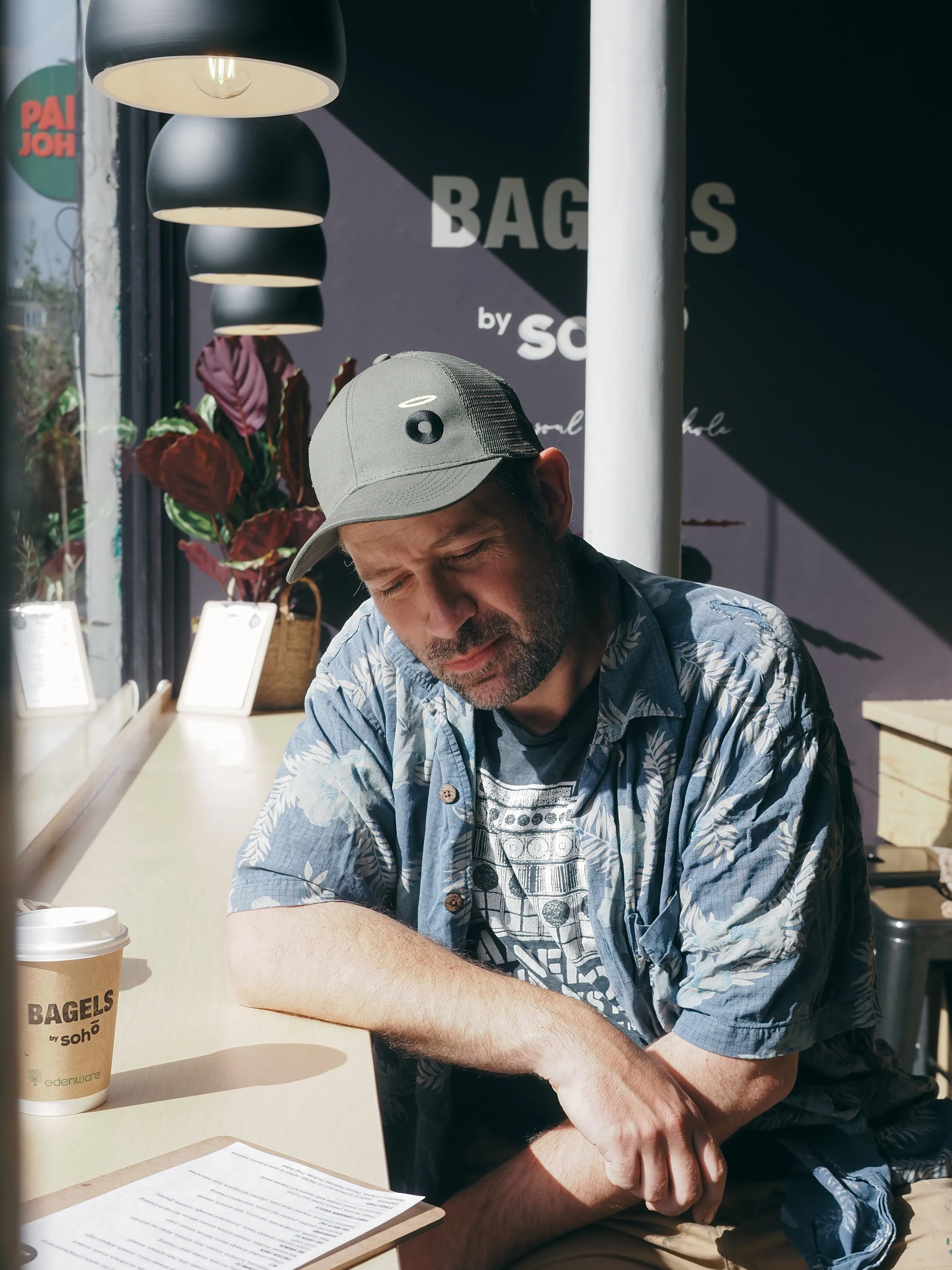
The identity extended across every touchpoint: interior and exterior design, brand guidelines, signage, uniforms, packaging, menus, loyalty cards, marketing materials and social media even sign-writing the boss’s vintage land rover! A business designed from top to bottom, inside and out.